 Choosing a color scheme for your online store might be an arbitrary decision based on your color preferences.
Usually peoples intuition for their color scheme is pretty good. But should you leave it to chance?
Spending a couple hours to learn the theory of color basics is recommended. If it does nothing else it will affirm the decisions you have made based off of your own intuition. But more likely it will or give you some deeper knowledge to craft your color scheme and result in increased sales.
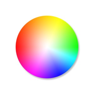
Color Basics
Basically, some colors look good together and some colors don’t.
Through mathematics and the invention of the color wheel we can see patterns of why this might be.
There is a great tool I use called Kuler that lets you choose a color and will then give you other colors that match based on rules you can choose from.
I will show you an example of this soon, but first I just want to discuss what impact choosing a base color will have on your brand.
Emotional Color
Colors have emotional meaning to your visitor and the color scheme you decide on for your brand needs to take this into account. It is no accident that fast food restaurants all use red to make you hungry, and IBM uses its corporate blue to represent trust.
Before you choose a color scheme, here are a few good exercises to identify a personality for your brand.
- Think of twenty words that describe your brand.
- If your brand was a car what sort of make would it be?
- What sort of feelings do you want to be associated with when someone sees your brand?
To learn more about what each color means here is a good article. http://www.smashingmagazine.com/2010/01/28/color-theory-for-designers-part-1-the-meaning-of-color/
Existing Brand Assets
If you already have a logo then you will often find that the colors you chose were intuitively based on some form of emotional color theory.
If you discover you have chosen incorrectly and it is too costly to update your printed material from the old colors you can leave your logo as is and just add some secondary colors that will give your brand the emotional meaning you were looking for.
A Note on Contrast
Black, white and shades of grey can be used in addition to the color scheme you choose for your site and you can use these to create contrast. Dark colors on light colors and vice versa (light colors on dark colors) stand out more on the page than two colors closer in shade.
You can use this to highlight a particular element on a page by making the contrast of its background greater.
Into Action
To show you an example, I will use the logo from a company Wooassist manages: www.iotagarden.com.au
https://www.dropbox.com/s/k09mmys93n967as/Screenshot%202015-01-09%2012.16.15.png?dl=0
Here are some notes when we re-designed the IOTA site about 12 months ago.
 We don’t want to change things too much so we will stick with the two base colors of light and dark blue that are used for the logo.
I would like to introduce one more color that is a bit brighter and contrasting with the current blues that will liven up the site.
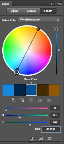
I am thinking maroon, but we can use adobe Kuler to see what a good contrasting color is mathematically.
These are the colors from the logo.
Light blue #8da5aa
Dark blue # 005293
Without going too much into the details of how Adobe Kuler works, the end results speak for themselves. When I enter base color dark blue # 005293, the complimentary color was a brown.
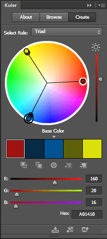 That didn’t suit the objectives of livening the site up so if we look at the triad relationship I can see the magenta color I was originally thinking of #a01410
And if we look at how these colors look together touching each other and apart you can see Kuler’s maths have not let us down. These colors look great together.

So here you can see with just a couple hours research and a couple of tools we were able to come up with a color scheme that suited our existing brand assets, while at the same time achieving our new objectives.
What color best represents the feeling of your brand?


