Wooassist

Assistance for Your Woocommerce Store

  • How it Works
  • Pricing
  • Services
    • Site Maintenance
    • AI SEO and Content Marketing
  • Blog
    • How-To Articles
    • Code Snippets
    • SEO For E-Commerce
    • Theme and Plugin Reviews
    • Wooassist News
    • WordPress/WooCommerce News
    • Interviews
  • About Us
  • Contact
You are here: Home / Archives for colors

Choosing a Theme for WooCommerce – What to Consider?

October 23, 2015 By John Leave a Comment

There are thousands of free and premium WordPress themes. You might need some help in choosing a theme for WooCommerce. But how exactly do you pick one that’s right for your Woocommerce store?

This article explains what to look for to fit the design requirements of your store and also the functionality requirements and to make sure your new theme will play nicely with Woocommerce.

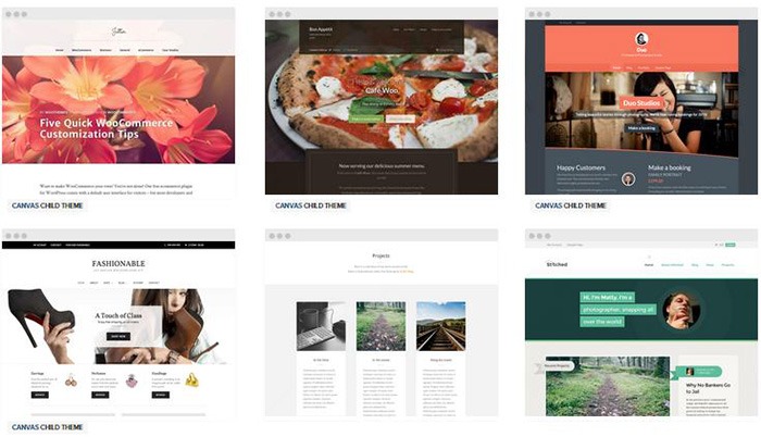
Different themes have different layout styles. Knowing what you want or need will make looking for a theme easier. Right sidebar, left sidebar, full-width, or maybe parallax? Are you going to be using image sliders? Also, it is important that the theme that you choose supports WooCommerce integration.

Once you know what you need, it might be a good idea to talk it over with your web developer. He might already know of a theme that will suit your purpose.

woocommerce-themes

Here are some criteria for choosing your theme:

Aesthetic Needs

Of course, you shouldn’t focus on the look alone. But, you also need to make sure that the theme matches the look and feel you want. You may be able to customize colors, but major changes on the design are best left to pros. As you choose a theme, it should meet at least 80% of your layout, visual, and content needs.

Stay away from poorly coded themes as this could spell problems for your website down the track when updates are needed.

Many themes also offer a lot of other functionalities that allow users to easily edit the look of their site. However, such themes could add unnecessary bloat to your website. This unnecessary bloat could put strain on your page load times and cost you sales.

Be cautious of Themeforest themes as they are notorious for this. Instead of using a theme with many customizable options, you’ll be better off editing the CSS of the child theme to get your desired look.

We recommend Genesis themes and Storefront.

WordPress Updates

Most themes should support the latest version of WordPress. Still, you should verify before making your purchase. Some older themes that are no longer being updated may not support the most recent updates to WordPress. It’s important to keep up with WordPress updates for functionality and security purposes.

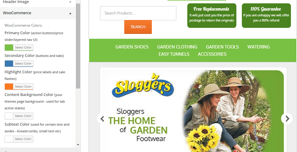
WooCommerce Compatibility

Your theme should be able to integrate with WooCommerce.

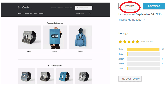
WooThemes recommends doing a quick check. Take a look at the theme’s demo and view the source code. You can do this by right-clicking on the page and clicking on “View Page Source”. Look for the WooCommerce version meta tag. Search for the words: WooCommerce Version

The closer it is to the current release of WooCommerce, the better. If it is nowhere near, look elsewhere for a better theme.

Also, go with a theme that has less custom WooCommerce templates. This is because having a lot of WooCommerce templates customized will be a pain to update.

The theme should not have a lot of unnecessary customizations which can be done through a plugin.

Multiple Layouts

Review the theme description and demo to ensure that the theme supports the layout you want to create.  Look for the theme’s documentation and review it to know if the theme can accomplish what you need.

storefront

Don’t just assume that the theme you chose will accommodate one or two sidebars, full width pages, or columns within content.

Theme Navigation

How many menus do you plan on having? Some site owners need secondary menu for categories. Check if the navigation bar can accommodate all your primary menu options. If you hired a web developer, discuss your content sitemap and navigation requirements first before buying your new theme.

Call-to-Actions

As an e-commerce website, you want your visitors to do something and eventually buy your product.

call-to-actions

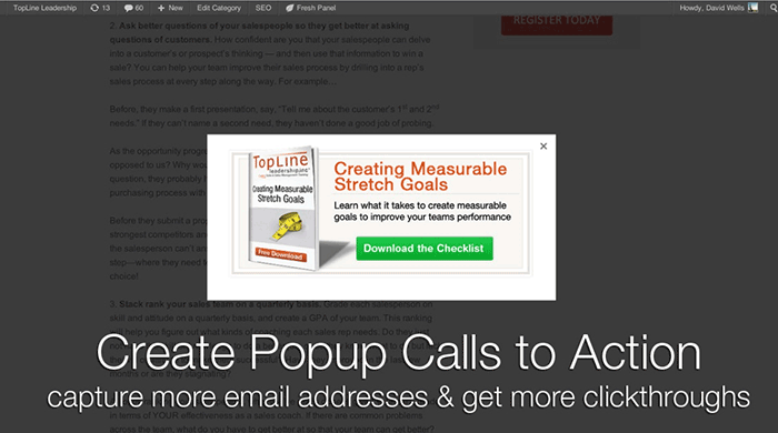
Make sure your theme can support your list of visitor to-do items. A cohesive design, with built-in options for call-to-actions is recommended.

SEO Friendly

WordPress is SEO friendly by default, but not all its themes are. To achieve an ideal SEO ranking, it’s important for search engines to digest your content. In this case, quality code and solid design architecture are required. Here’s a do’s and don’ts guide from Yoast to make your theme SEO friendly.

Level of support

Theme support is usually available by phone, email, video tutorial, instruction manuals, forums, etc.

support

However, some developers don’t have much time to provide support or answer forum questions that often. For beginners, make sure your theme offers lots of support features.

Reviews and Feedback

If there are available reviews, read through them thoroughly to point out any theme pros and cons.

reviews

Take note of trends, plugin conflicts, and complaints. It may not have a 100% satisfaction rating but a strong rating may be present. Look at both positive and negative feedbacks. Take negative feedbacks with a grain of salt.

Fixed vs Responsive

Most WordPress themes are now designed to be responsive. This means that your website adapts to fit the screen size of the device where it’s viewed. If a potential client is browsing your site, he’ll find it easy to navigate. Not all themes are responsive and since Google has started penalizing non-mobile responsive sites, a responsive design is the only way to go. There is no reason you should be creating a non-responsive site. Check out our post on Google’s Mobile-Friendly Update.

Do you have any more tips when choosing a theme for a WooCommerce site? Let us know in the comments.

Filed Under: How-To Articles, Theme and Plugin Reviews Tagged With: child theme, colors, Genesis, how-to, mobile friendly, responsive design, Storefront, WooCommerce, woothemes, WordPress, WordPress updates

Design Tweaks on WooCommerce

January 29, 2015 By John Leave a Comment

SnapCrab_2015-06-26_15-14-47_No-0000

Your online business using WooCommerce is all set. Each important element is in place and accounted for. Your website is done. You get regular traffic. You got your marketing strategies in place. You have a blog and you are active in social media. You think you’ve got it all covered, but then a few things start to bug you.

Optimize Web Design

You realize the design needs few tweaks and you come up with a few ideas that should be able to increase sales. What you have to do right now is optimize your design for better conversion rates. This is called conversion rate optimization.

A few design tweaks on your website will help increase your conversion rates. It may involve adjusting or repositioning some visual and design elements. Color, images, cues and their placement on your landing or checkout pages, are all part of optimizing your web design – see here design tweaks.

Keep Your Design Simple

Your website needs to look good, but not necessarily flashy. Simplicity in your design can go a long way towards increasing conversions.

It is understandable that you’d like to fill your pages with a lot of useful features and elements. However, it could also be a hindrance. Visitors would usually turn away from complicated designs. Keep it simple and understandable.

Design Tweaks

In changing the colors on your website, take the context into consideration. Make use of call-to-actions (CTA), and place them in a favourable manner to make your visitors take action. The design of your website should encourage visitors to want to browse more. Essentially, they should immediately see what they’re looking for.

Use the right amount of white space. It can definitely put emphasis on where it is needed. It is a simple and effective way of making sure that important elements of your site are easy to locate. This post enumerates user interface tweaks can you make, to improve your conversion rates.

Know Your Audience

An important part of adjusting your site’s design is learning about your potential customers. Understand who they are what their personalities are like. That way, you could adjust your design elements to fit in with them.

SnapCrab_2015-06-26_15-15-17_No-0000

You can read more about customer personas in these articles:

New MailChimp User Persona Research

Web Design Tips that Increase Conversions

Having a clear idea of your current users can help you better empathize with them. Combining these tips will not only get people to visit your site, but also encourage visitors to take the next step.

A few design tweaks on your WooCommerce store can set you up for better conversions which will in turn lead to better sales for your business.

Filed Under: How-To Articles Tagged With: call-to-action, colors, conversion optimization, CSS, customer persona, design tweaks, how-to, optimizations, WooCommerce

Choosing a Color Scheme For Your Online Store

March 9, 2015 By John Leave a Comment

Choosing a color scheme for your online storeChoosing a color scheme for your online store might be an arbitrary decision based on your color preferences.

Usually peoples intuition for their color scheme is pretty good. But should you leave it to chance?

Spending a couple hours to learn the theory of color basics is recommended. If it does nothing else it will affirm the decisions you have made based off of your own intuition. But more likely it will or give you some deeper knowledge to craft your color scheme and result in increased sales.

Color Basics

Basically, some colors look good together and some colors don’t.

Through mathematics and the invention of the color wheel we can see patterns of why this might be.

There is a great tool I use called Kuler that lets you choose a color and will then give you other colors that match based on rules you can choose from.

I will show you an example of this soon, but first I just want to discuss what impact choosing a base color will have on your brand.

Emotional Color

Colors have emotional meaning to your visitor and the color scheme you decide on for your brand needs to take this into account. It is no accident that fast food restaurants all use red to make you hungry, and IBM uses its corporate blue to represent trust.

Before you choose a color scheme, here are a few good exercises to identify a personality for your brand.

  • Think of twenty words that describe your brand.
  • If your brand was a car what sort of make would it be?
  • What sort of feelings do you want to be associated with when someone sees your brand?

To learn more about what each color means here is a good article.  http://www.smashingmagazine.com/2010/01/28/color-theory-for-designers-part-1-the-meaning-of-color/

Existing Brand Assets

If you already have a logo then you will often find that the colors you chose were intuitively based on some form of emotional color theory.

If you discover you have chosen incorrectly and it is too costly to update your printed material from the old colors you can leave your logo as is and just add some secondary colors that will give your brand the emotional meaning you were looking for.

A Note on Contrast

Black, white and shades of grey can be used in addition to the color scheme you choose for your site and you can use these to create contrast. Dark colors on light colors and vice versa (light colors on dark colors) stand out more on the page than two colors closer in shade.

You can use this to highlight a particular element on a page by making the contrast of its background greater.

Into Action

To show you an example, I will use the logo from a company Wooassist manages: www.iotagarden.com.au

https://www.dropbox.com/s/k09mmys93n967as/Screenshot%202015-01-09%2012.16.15.png?dl=0

Here are some notes when we re-designed the IOTA site about 12 months ago.

color-1
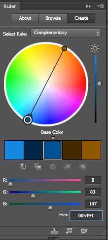
We don’t want to change things too much so we will stick with the two base colors of light and dark blue that are used for the logo. 

I would like to introduce one more color that is a bit brighter and contrasting with the current blues that will liven up the site. 

I am thinking maroon, but we can use adobe Kuler to see what a good contrasting color is mathematically. 

These are the colors from the logo.
Light blue #8da5aa
Dark blue # 005293

Without going too much into the details of how Adobe Kuler works, the end results speak for themselves. When I enter base color dark blue # 005293, the complimentary color was a brown.

color-2
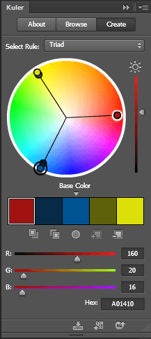
That didn’t suit the objectives of livening the site up so if we look at the triad relationship I can see the magenta color I was originally thinking of #a01410

 And if we look at how these colors look together touching each other and apart you can see Kuler’s maths have not let us down. These colors look great together.

color-3

So here you can see with just a couple hours research and a couple of tools we were able to come up with a color scheme that suited our existing brand assets, while at the same time achieving our new objectives.

What color best represents the feeling of your brand?

Filed Under: How-To Articles Tagged With: colors, conversion optimization, design tweaks, how-to

Woocommerce 2.3 Update: New Features and Common Issues Encountered

March 11, 2015 By John 4 Comments

It has been a month now since Woocommerce 2.3 was officially released. There has been mixed feelings about the new version. Some users find the new features awesome while others struggle to keep it together. To give you a recap, here are the new features of Woocommerce 2.3 “Handsome Hippo”.

Woocommerce 2.3 Features

  • User Interface and User Experience Update- Woocommerce 2.3, also known as the handsome hippo, has a flat design that goes well with many themes. The messages, notices (2 in the figure below), buttons (4), and the payment box during checkout has an updated look.Woocommerce 2.3 Cart Update

The cart template is also updated. The “Proceed to Checkout” button (5) was moved under the cart totals to enhance user experience. Another cool feature is the undo option (1) in the cart. That means that if you accidentally removed a product on your cart you can easily add it back in using the undo button. You also have the option to remove product from the cart widget (6), which I think is a really cool update on the default style template.

Woocommerce 2.3 cart_widget

There are also several features that were removed due to redundancy. The option to change the colors of the buttons as well as the increment and decrement button (3) were removed. Now, if you want to add those features back, you need to install additional plugins.

Woocommerce 2.3 also introduced an opt-in usage tracking that allows the Woocommerce team to view the settings of sites. This will allow them to upgrade their system to fit the requirements of their users. You will have an option to disable tracking in the woocommerce dashboard using this path: Woocommerce/System Status/Tools. Simply click the Reset Usage Tracking Settings button.

Woocommerce 2.3 usage_tracking

  • Coupons Update- This is probably one of the major updates in Woocommerce 2.3. Coupons will no longer be applied before taxes. The “apply before tax” option has been removed in the woocommerce settings.

Woocommerce 2.3 coupon

Aside from that, the rest of the coupons settings are left untouched. However, there are still a few issues with coupons that has not yet been sorted out on the latest version of woocommerce 2.3. We will get to that in a sec.

  • Emails- woocommerce 2.3 makes it easier for developers to override the CSS of emails sent through woocommerce. Additional hooks are created so that developers can easily adjust the CSS templates according to their preferences. In addition to that, emails sent will be using the woocommerce core templates but will also allow plugin templates to blend in with the shop emails.
  • Geolocation- Now, with “Handsome Hippo”, you can easily locate your customers by using their IPs. This can be used to calculate tax based on the users estimated location.

Woocommerce 2.3 Geo_Location

Issues Encountered

Woocommerce informed large theme companies about the changes before releasing Woocommerce 2.3. Prior to the official release, Woocommerce also released Woocommerce 2.3 beta so that they can work hand in hand with theme companies and plugin authors to make the release as smooth as possible. Though a lot of site owners welcome the design update on the front-end, some sites suffered from CSS and theme incompatibility and had to do a complete overhaul. Woocommerce 2.3 started using Sass, and there are inevitable plugin incompatibilities encountered by sites that use plugins using LESS.

The image below is taken from one of our sites that we manage. You will notice that the buttons, due to the flat design, need fixing. You can barely see the labels of the buttons.

Woocommerce 2.3 buttons_and_option_to_remove_products_from_cart_widget

To fix this issue, Woocommerce suggests installing a plugin that will allow site owners to easily change the colors of buttons and other elements on their sites. You can customize the buttons by clicking Appearance/Customize/Woocommerce.

Woocommerce 2.3 buttons

On the same site, we also encountered problems with the application of coupon codes. Though the products added are exclusive of tax, which means that the tax calculations will not be affected, we experienced a weird issue with the application of coupons on top of a free shipping rule. The free shipping rule allows customers to get free shipping when the item bought is more than $49.

If you look at the image below, instead of displaying the free shipping note on the “Shipping and Handling”, it has been replaced by a radio. Here you will have the option to either choose free shipping or flat rate, which doesn’t make sense because customers would always want to choose the free shipping option. Aside from that, if you apply a coupon and the order total falls below $49, the flat rate automatically kicks in without the free shipping option. The store owner would not want that to happen and this issue only started after the Woocommerce 2.3 update. We will be discussing the solution to this issue on our next article.

Woocommerce 2.3 increment_decrement,_notices-2.3

Conclusion

Keeping your plugins up to date is very important. However, with major updates like this, it is best that you create several backups of your live site before doing anything. In some cases, it might even be necessary to copy your live site to a development site. Doing plugin updates on the development site allows you to fix errors caused by the update and at the same time reduce losses due to downtime.

The woocommerce team spend so much time and dedication for this update. Though there may be some hiccups along the way, their proactive communication with theme companies have been really helpful in ensuring that the update will not cause serious problems to their users.

If you have encountered some issues regarding the woocommerce 2.3 update or if you want to share your take on the new features of woocommerce, feel free to leave your comments below.


Filed Under: Theme and Plugin Reviews Tagged With: checkout form, colors, CSS, email, plugins, shopping cart, WooCommerce, woothemes, WordPress updates

Let us support your online store so you can manage your business

Get started today

Get 2 Hours of FREE SUPPORT

We are so confident that you will love our services that we will give you your first 4 hours at a 50% discount

That’s 4 hours for only $75

BUY NOW

Free eBook

5 Things Every Online Store Can Fix On Their Website In The Next Week To Increase Sales

Quick Links

  • How it Works
  • Pricing
  • Blog
  • Contact
  • About Wooassist
  • My Account
  • Checkout
  • Privacy Policy
  • Cookie Policy
  • Terms and Conditions

Wooassist

Australia:
59 Luke St.
Hemmant QLD 4174

Philippines:
San Miguel St.
Poblacion, Iligan City 9200

Connect


Copyright © 2026 · Wooassist

Yours FREE!

5 Things Every Online Store Can Fix On Their Website In The Next Week To Increase Sales