Wooassist

Assistance for Your Woocommerce Store

  • How it Works
  • Pricing
  • Services
    • Site Maintenance
    • AI SEO and Content Marketing
  • Blog
    • How-To Articles
    • Code Snippets
    • SEO For E-Commerce
    • Theme and Plugin Reviews
    • Wooassist News
    • WordPress/WooCommerce News
    • Interviews
  • About Us
  • Contact
You are here: Home / Archives for mobile friendly

What to Do When Your WooCommerce Store’s Theme is Abandoned or Outdated?

October 19, 2018 By John Leave a Comment

What to Do When Your WooCommerce Store’s Theme is Abandoned or Outdated

We’ve had a few clients who have used themes that were abandoned by the theme developers. In some cases, the store owners come to us with problems regarding their theme and then we find out that the theme has not been updated in over a year. And when a theme has not been updated in a long time, it is inevitable that features will break.

Features Will Break

Sometimes it may just be small formatting issues. While formatting issues are usually easy to fix, this is just a band aid to a big problem. When running an outdated theme, the ideal solution is to address the root of the problem. Update the theme or change to a different theme that is constantly receiving updates.

Sometimes, an outdated theme can break some more important features when it has deprecated codes. These deprecated codes are no longer supported in current versions of WordPress or WooCommerce. Also, new features introduced in WordPress and WooCommerce may not work on your outdated theme. Unless you do something about it, things will just keep breaking. When a core feature of WooCommerce breaks as a result of an outdated theme, your online store will be put out of commission.

Dangers of Running an Outdated Theme

An outdated WordPress theme is not secure

Aside from breaking your site in the absence of updates, running an outdated theme is a major security issue. You are leaving your WooCommerce store vulnerable to many exploits. Some WordPress security tweaks might help keep your site secure. However, when your theme is not receiving updates, these security tweaks won’t help.

The Solution

The only solution to an outdated theme is to replace it with a new theme that is constantly receiving updates.

One thing to consider though is if you have spent hundreds of hours of work on your current theme. In this case, it might be worth hiring someone that will update your theme. If you are going to have someone updating your theme, make sure that that someone also addressed the latest known security vulnerabilities. Also, consider the costs of maintaining an outdated theme. Would it be more cost-effective in the long run if you changed your theme now?

How to Choose a New Theme

When you’ve decided that you want to go with a new theme, there are a few things to consider when choosing one.

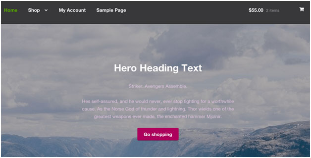
Choose a Theme that is Responsive

A responsive theme is a theme that adjusts to different screen sizes. A theme must look good on both a mobile device and a desktop computer. Since Google now considers mobile devices in its search engine rankings, it is imperative to choose a theme that is responsive. Under no circumstances should you use a theme that is not responsive.

Choose a responsive theme

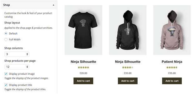
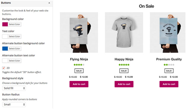
Choose a Theme that is Light

Another option to consider is choosing a theme that is not bloated by unnecessary features. It is definitely handy when a theme can let you change fonts, colors and your page layout in just a few clicks. However, this means that the theme is bloated with code that will slow down your site. What used to be one line of CSS code to change the color of your navigation menu can be hundreds of lines of code built into your theme. Themes made by Themeforest are notorious for this. And while it does make the life of a non-technical WooCommerce entrepreneur a lot easier, you have to ask yourself. Do you really want to add that much bloat to your site when site speed is such an important factor for both SEO and user experience?

Choose a Theme that was Developed by Trusted Developers

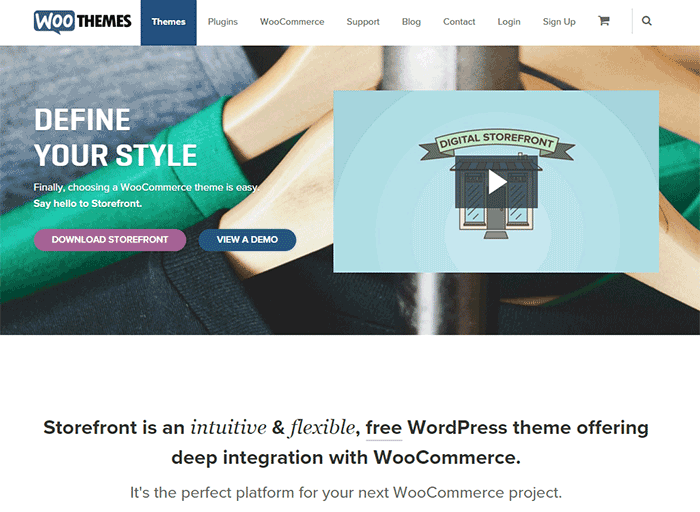
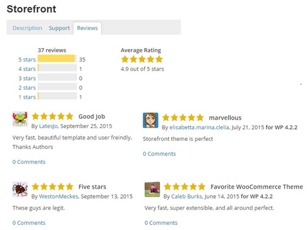
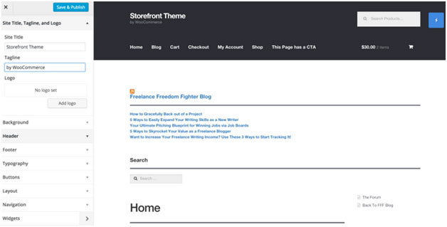
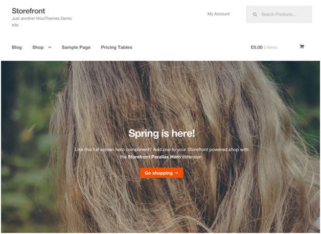
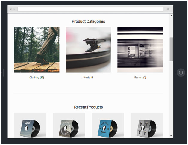
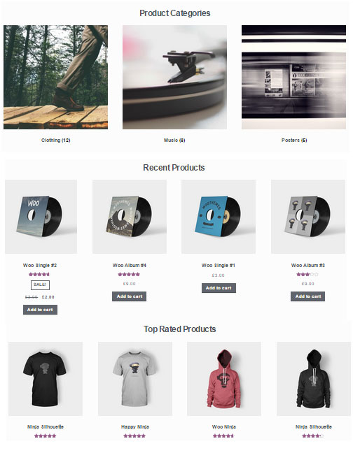
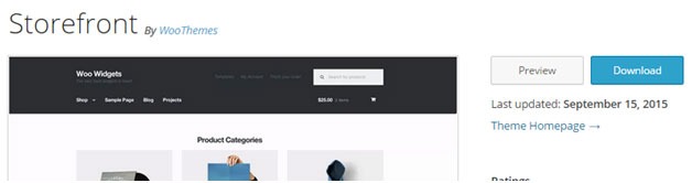
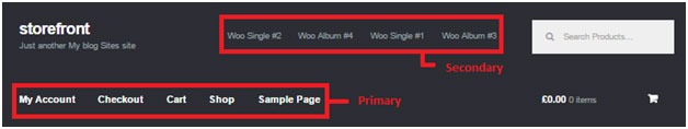
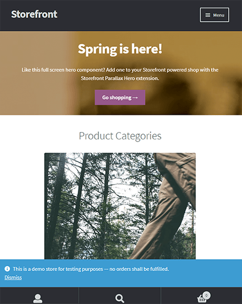
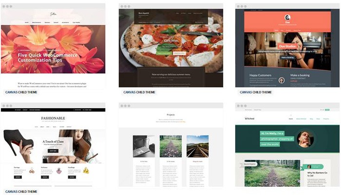
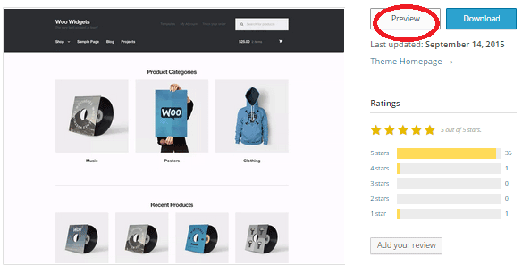
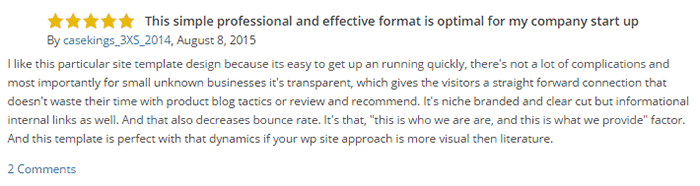
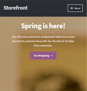
There are hundreds if not thousands of themes to choose from. But how do you know which ones are good? One way to look at a theme is to consider the developers who made the theme. We can recommend using Storefront theme since it is made by the same developers that created WooCommerce. You can be guaranteed that Storefront theme will work with WooCommerce with no issues.

The Genesis framework is also a good option. Note that Genesis is a theme framework and you will need to install a child theme when you use it.

Costs of Changing to a New Theme

Cost of Changing to a New ThemeEven if you choose to use a free theme such as Storefront, changing to a new theme will still cost you. If you are able to change your theme on your own, it won’t cost you anything financially but you’ll still be spending a lot of time on it. Hire people to do the grunt work. Don’t spend dozens of hours trying to work on tweaks to your theme when a developer can do it in an hour or two. If you don’t have access to a developer, you can contact the Wooassist team. We can help you change your theme.

What to Do Before Changing Your Theme?

Before changing your theme, it is best practice to create a development or staging site and test your new theme installation there. Several hosting providers such as WPEngine and Siteground have built in tools that let you easily create a staging site in just a few clicks. You can also create a development site manually.

Also, create backups. Before doing any development work on your WooCommerce store, it is important to create a backup. In the event that you break your site, you always have a working backup that you can restore.

What to Do Before You Go Live with Your New Theme?

When you’ve installed your new theme and you’ve done all of the tweaks that you want, it is important to do some user testing. Testing your site is a necessary step before moving any major changes to the live site. Check out this blog posts for a list of things that you need to check before your site goes live. On top of the list, make sure to check that any custom features that you have added to your site are working.

Do you require any help with changing an outdated theme? Drop us an email and we might be able to help.

Filed Under: How-To Articles Tagged With: Genesis, mobile friendly, responsive design, Storefront, WooCommerce

Storefront Theme Review

January 1, 2016 By John Leave a Comment

Storefront is the official WooCommerce theme built to the same high standards as WooCommerce itself. Best of all? It’s free!

storefront

A Storefront theme review is due. Here’s what’s included in this article:

  • Storefront Theme Overview
  • Storefront Key Features
  • What Makes Storefront Great
  • WooCommerce Integration
  • Storefront Setup
  • Arrival of Storefront 1.5
  • Storefront WooCommerce Styling
  • Popular Storefront Extensions
  • Choosing A Theme

Why WooCommerce?

WooCommerce is still the most popular e-commerce platform.

This open source e-commerce plugin for WordPress was launched in 2011 and is aimed at small-to-medium online merchants already comfortable with a WordPress set up.

There are a lot of free and premium themes to choose from, one of the most popular is – Storefront.

Storefront Theme Overview

Storefront is described as an intuitive, lightweight, and flexible theme offering deep integration with WooCommerce. It has several layout and color options to personalize your shop, multiple widget regions, a responsive design, and much more.

The main goal in developing Storefront is to provide a rock-solid foundation for your WooCommerce store without extra bloat or features.

It comes to no surprise that it reaches up to 3,000 downloads per day:

Integration:

Storefront theme is built and maintained by the same team that developed WooCommerce. This is why the integration between WooCommerce, its extensions, and Storefront is water-tight.

No Conflicts:

For e-commerce sites, uptime is of utmost importance. With the new Storefront, there will be no conflicts between theme and plugin during major WooCommerce updates.

storefront-reviews

Here’s a glimpse of some of its great reviews:

Solid Foundation:

Based on the popular Underscores starter theme, Storefront features a responsive layout, and schema markup for enhanced SEO performance.

Clean and Simple:

storefront-clean-simple-design

Storefront allows you to customize your store to match your brand by providing a clean and simple design.

Storefront Key Features

Most store owners want their e-commerce theme design to be simple and flexible. Storefront can offer exactly that.

Here are some of the key included features:

WooCommerce Integration

storefront-woocommerce-integration

Storefront features an unrivalled deep integration with WooCommerce. Of course, having been developed by WooCommerce authors, this integration is compliant with the latest WooCommerce developments and standards.

Lightweight and Robust Core

Storefront-Lightweight-and-Robust-Core

Storefront is based on Automattic’s popular underscores starter theme. Its codebase is under constant review ensure it is kept nice and clean to provide as little disruption and conflicts as possible..

Design Customization

storefront-design-and-customization

Every store owner would want to create a look and feel that matches their business. There are several display settings in Storefront that let you customize the design of your page to meet your requirements. Settings are all accessible in the WordPress Customizer.

What Makes Storefront Great

what-makes-store-front-great

The Storefront philosophy is to do one thing well and provide a solid foundation for your online store. Although the theme appears to be plain, it’s meant to be a starting place that includes deep WooCommerce integration.

Keep in mind that simple is usually more profitable. Unless you are spending a few grand on a professional designer then the fancy design you try and add yourself will most likely distract the user and lose sales.

No Shortcodes and Page Builders

Shortcodes in WordPress are little bits of code that allow you to do various things with little effort. You only get what you need with Storefront, which means you won’t encounter any superfluous shortcodes and page builders.

The Storefront team believes that not including these features allows you to add them via whichever plugin you prefer. Even if you switch themes later on, all of those features will remain. According to the release announcement, Storefront was built with data portability in mind. This means that users will be able to switch themes without losing their content.

Appropriate Sliders

Whether you should use slider is a highly debated topic. While other WordPress themes bundle sliders, Storefront lets you choose the appropriate plugin for your slider needs if you decide you do want one. It is also compatible with the WooSlider plugin.

WordPress offers many slider plugins to add them to your home page, landing pages, posts, or anywhere you want.

storefront-slider

Schema Markup

Schema markup is code that you put on your website to help the search engines return more informative results for users. The content on your website gets indexed and returned in search results. Storefront has valid schema markup for improved SEO performance.

Display Options

storefront-display-option

In addition to attractive products, the design of your shop is equally crucial. It’s important to make a good first impression with the help of professional design. With Storefront, you can change the look and feel of your store in a few clicks, and see your tweaks in real-time.

Responsive

If your site can’t be viewed effectively on mobile devices, you could be losing almost 50% of your customers.

Storefront on mobile device:

storefront-on-mobile

Storefront on tablet:

storefront-on-tablet

Non-responsive sites are now considered second-class businesses by Google. Storefront will adapt and display beautifully whether you view your store on a laptop, desktop computer, or handheld device.

Localized and Accessible

Storefront is fully localized and ready for your translations. It also adheres to the strict wordpress.org accessibility guidelines. That is why your store will be accessible to the widest audience possible.

Custom Homepage Template

The homepage template in Storefront has been tested for user experience and conversion. It displays product categories, recent, featured, on sale & top-rated products.

storefront-custom-homepage-template

It’s a great start for most small businesses to immerse the visitor in your products, while providing enough flexibility to promote the products that will make you the most profit.

WooCommerce Integration

It includes deep integration for WooCommerce and it’s most popular extensions. This means everything will look nice straight away and you won’t have to hire a professional developer or designer to make things fit in.

Some of the more popular extensions supported are:

WooCommerce Bookings

storefront-woocommerce-bookings

This extension is perfect for those wanting to offer services, appointments, or rentals. It allows you to sell your time or date based bookings, adding a new product type to your WooCommerce site.

WooCommerce Wishlists

storefront-wishlist

From birthdays to weddings, and everything in between, this extension allows guests and customers to create and add products to an unlimited number of Wishlists.

WooCommerce Brands

storefront-brands

This extension for WooCommerce allows you to create brands for your shop; each brand can be named, described and assigned an image.

WooCommerce Subscriptions

storefront-subscriptions

WooCommerce Subscriptions is an extension that allows you to introduce a variety of subscriptions for physical or virtual products and services. Create product of the month clubs, weekly service subscriptions, or even yearly software billing packages.

WooCommerce Memberships

WooCommerce Memberships

WooCommerce Memberships allows you to create a membership system that is tied completely to your WooCommerce Store. It is fully compatible with Storefront theme. You can restrict content to certain memberships classes. You can also turn your store into a membership club by restricting purchases to members. Among other useful features, you can even give members special discounts.

Composite Products

Composite Products allows you to create customizable products for your WooCommerce store. It is now fully compatible with Storefront theme. You can allow your customers to customize certain parts of their order.

WooCommerce Composite Products

Storefront Setup

Almost all of the Storefront setup can be done via the theme Customizer.

storefront-setup

The easiest way to install Storefront is through the WordPress dashboard.

  1. Navigate to Appearance > Themes > Add New
  2. Hover over the Storefront screenshot and click the ‘Install’ button to install the theme.
  3. Activate Storefront as you would any other WordPress theme.

To install Storefront manually:

storefront-manual-install
  1. Download the latest version here.
  2. Upload the extracted folder to the /wp-content/themes/ directory on your server via FTP
  3. Activate Storefront from the Appearance > Themes screen in your dashboard

Read more on how to install and use themes here.

Menus

Storefront has two menu locations, Primary and Secondary. If you do not assign a Menu to the primary navigation, it will display each of your pages. On the other hand, the secondary navigation will display nothing.

storefront-menus

After activating Storefront for the first time, you won’t see anything in the secondary navigation. Here’s your guide to creating and assigning menus to theme locations.

Page Templates

Storefront comes with just two page templates.

Full Width

storefront-fullwidth

This is just a standard page template without a sidebar, allowing the content to span the full width of your site.

Homepage

storefront-homepage

The homepage template allows you to display a multitude of products and product categories.

Here’s a Woothemes guide on installing and configuring Storefront.

Arrival of Storefront 1.5

After the success of Storefront comes the newly improved Storefront 1.5, which achieves another coveted tag on wordpress.org. Its primary feature? A support for right-to-left languages in Storefront. The traditional RTL support standard overloads an additional stylesheet on top of the primary one.

storefront-version1-5

With Storefront 1.5, if you install WordPress in a right-to-left language, the theme will automatically recognize it. It will then load a different set of stylesheets tailored to that language. This makes Storefront a stronger global theme solution for WooCommerce.

You can also expect the following improvements:

Integration with More Extensions

storefront-integration-extentsion

Storefront 1.5 has increased the number of customer-facing extensions it integrates with to 11. It offers added support for WooCommerce Deposits and Product Bundles.

Revamped 404 Page

storefront-revamped-404

Storefront 1.5 is now made to be more useful to folks browsing a shop. The new 404 page now includes a product search box, links to product categories, featured products and popular products.

Featured Images

The previous version of Storefront didn’t cater to adding featured images to pages. Now, once you add a featured image to a page, it will appear on the frontend directly above the page title.

Scrolling Header Cart

storefront-header-cart

Considered a handy feature, the header cart lets visitors access their cart total, and the number of items it contains. It also reveals the carts contents upon hover. Using Storefront 1.5, the cart dropdown now has a set height that scroll as more items are added.

You can check out their awesome video about Storefront here.

Storefront WooCommerce Styling

A lot of themes we see, from Themeforest especially, do not style WooCommerce according to the best practice standards set by the Woocommerce authors.

The most common problem is overriding templates.  This causes the cost to update WordPress, Woocommerce and the theme itself to sky rocket down the track. You won’t have this problem with Storefront.

Shop Pages

storefront-shop-pages

When it comes to shop pages, you can style for all product details and WooCommerce widgets, such as the price filter. The number of products per page is also automatically adjusted to 12.

Single Product Page

storefront-single-product

Single product pages include appropriate WooCommerce styling as well. The product tabs are presented in a vertical layout, and the number of related products is adjusted to three.

Cart and Checkout Page

storefront-cart-checkout

The checkout template features a two-column layout, with customer details on the left, and order details on the right. The ‘Place Order’ button is also always in view, making it easy to complete orders for customers.

storefront-place-order

And Now, It’s Storefront 2.5

Improved Mobile Design

From Storefront 2.0 and up, the theme now offers an improved mobile design for better mobile experience. The header section has been redesigned so that the content appears further up. This ensures that your visitors see more of the content on your WooCommerce store right away.

Storefront 2.0 Mobile View

New typography

Storefront 2.0 and up introduces a new font. Default font for WooCommerce has been changed from Helvetica to Source Sans. The font change provides users “greater depth and cohesion”. Some other small changes have been made to the design to fit the new font.

Introducing “Best Selling” Products

The theme also now offers a “best selling” products section on the home page. This is separate from product categories, recent products, featured products, top rated products and on sale products. Also, “Recent Products” has been renamed to “New In” and “Featured Products” have been changed to “We Recommend”.

Improved Appearance for Better Overall User Experience

Some other small changes have been put in place for better user experience. These include changes to styles, tables and embeds. The developers have also integrated with WordPress 4.5’s custom logo functionality. Adding a logo to your WooCommerce store is now made easier. Now there’s no need to install a plugin just to add your logo.

Popular Storefront Extensions

While Storefront provides a lot for free, there are some premium \add-ons that can add functionality or styling options to the theme.

Storefront WooCommerce Customiser

storefront-customizer

Without any custom code you can change or adjust labels and number of products displayed in homepage sections, which product details are shown on shop pages, and more.

It also lets you remove the product search and cart from the header.

Storefront Designer

storefront-designer

The Storefront Designer plugin adds the ability to change header layouts and make the header remain at the top of the page on scroll (sticky header). It also allows you to adjust button layouts and styles, and change some typography options.

Storefront Parallax Hero

storefront-paralax-hero

This plugin can be used to display a message and call to action over the top of an image on your homepage. It has a parallax effect, which means as the user scrolls the text and button appear to move over the image.

Child Themes

What is a child theme? According to the WordPress Codex:

A child theme is a theme that inherits the functionality and styling of another theme, called the parent theme. Child themes are the recommended way of modifying an existing theme.

In the case of Storefront, Storefront is the parent theme. You can check out the available child themes here.

Importance of a Child Theme – Easy and Safe Updates

When using a child theme, you will not lose any custom code or any custom styles that you have added to the child theme whenever you update the parent theme. Many website owners have learned the hard way losing custom code they have added to their themes after updating it. If you have a child theme, your custom updates are safe whenever a new version of the parent theme is available. We still recommend creating website backups every time you update your theme though.

Storefront: The Final Analysis

Simple, clear, and customizable, the Storefront theme for WordPress has everything to help you achieve success in e-commerce. For a free theme, the design is simple and no-nonsense and WooCommerce integration is unmatched by any other theme.

It may be too plain for some and if you are one of those, just ask yourself. Is it your personal taste and desire for it to look pretty, or is it a decision based on your user experience and the ultimate profitability of your site? In our experience, often the simpler the site the better is the user experience and the more profitable the website.

However, if you can’t find a Storefront child theme that resonates with you and don’t want the cost of a professional designer you might want to take a look at http://www.studiopress.com. They are the only other theme author we recommend if you don’t want to have troubles down the track when it comes to updates and customizations. It will take a bit more time to integrate with WooCommerce, but they have some lovely designs.

Filed Under: Theme and Plugin Reviews Tagged With: 404 error, checkout form, child theme, e-commerce, mobile friendly, plugins, shopping cart, Storefront, WooCommerce, woothemes

Choosing a Theme for WooCommerce – What to Consider?

October 23, 2015 By John Leave a Comment

There are thousands of free and premium WordPress themes. You might need some help in choosing a theme for WooCommerce. But how exactly do you pick one that’s right for your Woocommerce store?

This article explains what to look for to fit the design requirements of your store and also the functionality requirements and to make sure your new theme will play nicely with Woocommerce.

Different themes have different layout styles. Knowing what you want or need will make looking for a theme easier. Right sidebar, left sidebar, full-width, or maybe parallax? Are you going to be using image sliders? Also, it is important that the theme that you choose supports WooCommerce integration.

Once you know what you need, it might be a good idea to talk it over with your web developer. He might already know of a theme that will suit your purpose.

woocommerce-themes

Here are some criteria for choosing your theme:

Aesthetic Needs

Of course, you shouldn’t focus on the look alone. But, you also need to make sure that the theme matches the look and feel you want. You may be able to customize colors, but major changes on the design are best left to pros. As you choose a theme, it should meet at least 80% of your layout, visual, and content needs.

Stay away from poorly coded themes as this could spell problems for your website down the track when updates are needed.

Many themes also offer a lot of other functionalities that allow users to easily edit the look of their site. However, such themes could add unnecessary bloat to your website. This unnecessary bloat could put strain on your page load times and cost you sales.

Be cautious of Themeforest themes as they are notorious for this. Instead of using a theme with many customizable options, you’ll be better off editing the CSS of the child theme to get your desired look.

We recommend Genesis themes and Storefront.

WordPress Updates

Most themes should support the latest version of WordPress. Still, you should verify before making your purchase. Some older themes that are no longer being updated may not support the most recent updates to WordPress. It’s important to keep up with WordPress updates for functionality and security purposes.

WooCommerce Compatibility

Your theme should be able to integrate with WooCommerce.

WooThemes recommends doing a quick check. Take a look at the theme’s demo and view the source code. You can do this by right-clicking on the page and clicking on “View Page Source”. Look for the WooCommerce version meta tag. Search for the words: WooCommerce Version

The closer it is to the current release of WooCommerce, the better. If it is nowhere near, look elsewhere for a better theme.

Also, go with a theme that has less custom WooCommerce templates. This is because having a lot of WooCommerce templates customized will be a pain to update.

The theme should not have a lot of unnecessary customizations which can be done through a plugin.

Multiple Layouts

Review the theme description and demo to ensure that the theme supports the layout you want to create.  Look for the theme’s documentation and review it to know if the theme can accomplish what you need.

storefront

Don’t just assume that the theme you chose will accommodate one or two sidebars, full width pages, or columns within content.

Theme Navigation

How many menus do you plan on having? Some site owners need secondary menu for categories. Check if the navigation bar can accommodate all your primary menu options. If you hired a web developer, discuss your content sitemap and navigation requirements first before buying your new theme.

Call-to-Actions

As an e-commerce website, you want your visitors to do something and eventually buy your product.

call-to-actions

Make sure your theme can support your list of visitor to-do items. A cohesive design, with built-in options for call-to-actions is recommended.

SEO Friendly

WordPress is SEO friendly by default, but not all its themes are. To achieve an ideal SEO ranking, it’s important for search engines to digest your content. In this case, quality code and solid design architecture are required. Here’s a do’s and don’ts guide from Yoast to make your theme SEO friendly.

Level of support

Theme support is usually available by phone, email, video tutorial, instruction manuals, forums, etc.

support

However, some developers don’t have much time to provide support or answer forum questions that often. For beginners, make sure your theme offers lots of support features.

Reviews and Feedback

If there are available reviews, read through them thoroughly to point out any theme pros and cons.

reviews

Take note of trends, plugin conflicts, and complaints. It may not have a 100% satisfaction rating but a strong rating may be present. Look at both positive and negative feedbacks. Take negative feedbacks with a grain of salt.

Fixed vs Responsive

Most WordPress themes are now designed to be responsive. This means that your website adapts to fit the screen size of the device where it’s viewed. If a potential client is browsing your site, he’ll find it easy to navigate. Not all themes are responsive and since Google has started penalizing non-mobile responsive sites, a responsive design is the only way to go. There is no reason you should be creating a non-responsive site. Check out our post on Google’s Mobile-Friendly Update.

Do you have any more tips when choosing a theme for a WooCommerce site? Let us know in the comments.

Filed Under: How-To Articles, Theme and Plugin Reviews Tagged With: child theme, colors, Genesis, how-to, mobile friendly, responsive design, Storefront, WooCommerce, woothemes, WordPress, WordPress updates

How to Increase Mobile Conversion Rates for Your WooCommerce Store

January 21, 2020 By John Leave a Comment

Over the last few years, optimizing for mobile devices has become increasingly more important. More and more users browse the internet using their phone. According to Statista, 52.2 percent of web traffic comes from mobile phones and it has only been increasing from the previous years. As a WooCommerce store owner, you must optimize your website for conversion on these smaller screen sizes. Learn how to increase mobile conversion rates for your WooCommerce store by following the tips below.

How to Increase Mobile Conversion Rates for Your WooCommerce Store

How to Optimize Your WooCommerce Store for Mobile Devices

Use a Responsive Theme

All modern themes are now built to be responsive. A responsive theme adjusts to various screen sizes. You can check with your theme developer if your theme is responsive. You can also do a quick test by going to your WooCommerce store and then try scaling down the size of your browser. If you see the elements on your website move to adjust to the smaller window, then you are using a responsive theme. If you find that your theme is not responsive, don’t worry. You can switch to a responsive theme. We can recommend Storefront and the Genesis framework.

Storefront was made by the same developers that developed WooCommerce. It is built specifically for WooCommerce so you can expect full compatibility with WooCommerce and official WooCommerce plugins.

Genesis, on the other hand, is a framework. You need to use a Genesis child theme with the Genesis framework. Genesis is well-maintained, responsive and compatible with WooCommerce. 

User Test Your Mobile Site

Open your WooCommerce store on your smartphone and do some user testing. Perform actions that you expect your customers to do on your WooCommerce store. Important elements to test are:

  • making a purchase
  • subscribing to your newsletter
  • sending a message using your contact form
  • filling out the checkout fields
  • updating your shopping cart
  • commenting on blog posts
  • tapping on call-to-action buttons

There may be more that you need to test that is specific to your website. Take note of any difficulties that you encounter and get them fixed. Should you need help fixing any issues, the Wooassist team can help.

Use White Space and Large Fonts

Don’t skimp on using white space on your mobile site. Use it to your advantage. Since mobile devices have small screens, it makes it hard for the user to navigate or read your site if the elements are too close together. Also, make sure your site is easy to read by increasing font size.

Optimize Your Checkout Page

Your checkout page is one of the most important pages on your website. Limit your checkout form fields to only the necessary details. Remove any distractions to completing checkout. Make sure that the form fields are tall enough that they are easy to tap and fill out. Make the checkout button large enough so it is easy to tap. Don’t make the checkout process a burden to your customers.

Remove AutoPlay Videos and Pop-ups

Pop-ups and autoplay videos are annoying for desktop sites. Even more so on a mobile site. Don’t burden your customers with extra data charges from autoplay media. In some cases, these elements may be necessary. But if they don’t help you increase your sales, consider removing them. Instead, focus on making your customers click on your call-to-action buttons.

Improve Your Site Speed

Site speed has become very important as it is now a ranking factor for SEO. On the mobile platform, site speed is critical with mobile data speeds being slower than a wired internet connection. If your mobile site takes too long to load, the user will just leave. There are a lot of tools at your disposal to determine how you can improve your site speed. Google PageSpeed Insights even shows recommendations specific to your mobile site. Other tools that we can recommend are GTmetrix and Pingdom Website Speed Test. 

Optimize Your Images

This is related to site speed but deserves its own section. Many WooCommerce store owners neglect optimizing images and just upload willy nilly. If you upload large images without optimizing them, your mobile conversion rates would take a hit. You can use a plugin to optimize the images you’ve already uploaded. However, if you’ve uploaded images that have dimensions bigger than the image placeholders, they will need to be manually optimized. If you’ve been doing this for years, then you’ve got a big task ahead of you. To manually optimize images, you can follow the instructions in this blog post.

Optimize Your Site Navigation on Mobile

Poor navigation can make or break a mobile website. Make sure that your mobile website is easy to navigate otherwise your customers will leave your site out of frustration. Use a hamburger menu. If you are using a responsive theme, the hamburger menu should be built in. If not, you can custom code your mobile menu or use a plugin.

Offer Multiple Payment Gateways

It is important to offer the payment gateway that your customers prefer. On the mobile platform especially, depending on your location, mobile wallets are a thing. If you can tap into that market, you can improve your conversion rate. For iPhone users, there’s Apple Pay which you can enable on WooCommerce.

Just follow all the tips above to increase your mobile site’s conversion rates. If you have any tips that you can add or any questions at all, let us know in the comments.

Filed Under: How-To Articles Tagged With: checkout, checkout form, conversion optimization, image optimization, mobile friendly, navigation, responsive design, site speed optimization, woocommerce checkout

How to Center Logo in Storefront Theme

February 12, 2016 By John 35 Comments

Centering the logo on a WordPress site is a popular design concept, but doing it can be tricky. Most themes, Storefront included, are styled with the logo aligned to the left.

While you can use a premium plugin like Storefront Designer to center the logo, you can edit your child theme’s CSS instead. There are two benefits in doing this manually. For one, you don’t have to buy a plugin. Secondly, you don’t add extra bloat to your site.

How to Center Logo in Storefront with CSS

Centering Your Logo with CSS

Before anything else, you should install a child theme on your site otherwise the changes you make will be lost every time you update your theme. Alternatively, you can use Simple Custom CSS Plugin which creates a new stylesheet that won’t get overwritten.

Add the following code to your child theme’s styles.css:

@media screen and (min-width: 768px) {
	.site-branding{
		text-align: center;
		margin: 0 auto !important;
		float: none !important;
	}
}

Text align and margin set the margin to adjust accordingly to the sides. We need to place “!important” in that line to make sure that it gets priority and doesn’t get overridden by other CSS codes.

We also need to override the default “float:left;” code so that it won’t stick to the left. We do this using “float:none !important;”.

To make sure these styles don’t affect the mobile version of your site, we set a minimum width in the selector.

Doing Away with the Secondary Menu and Search Bar

If you are using Storefront out of the box, the secondary menu and the product search bar will still be in the way. We need to do something about that next. Temporarily, the header will look something like this.

Doing Away with the Secondary Menu and Search Bar

To remove the secondary menu, go to Appearance > Customize > Menu > Menu Locations and do not set the secondary menu to anything.

To move the search bar inline with the main navigation and cart menu, you have to paste the code below to your functions.php file. A word of warning, do not proceed with this step if you do not know what you are doing. One slip up here could cause your site to go down and become inaccessible. Alternatively, you can install My Custom Functions plugin to insert the code. The plugin warns the user the code will cause a fatal error.

add_action( 'init', 'jk_remove_storefront_header_search' );
function jk_remove_storefront_header_search() {
remove_action( 'storefront_header', 'storefront_product_search', 	40 );
add_action( 'storefront_header', 'storefront_product_search', 	70 );
}

After this step, your site will look something like this.

Move search bar inline with the main navigation and cart menu

The product search bar is still not inline with the main navigation as you can see. The CSS code below will adjust the width of the main navigation so that the search box won’t warp around to the bottom.

/*adjusting the width of the main-navigation*/
.woocommerce-active .site-header .main-navigation {
	width: 50%;
}

Applying the CSS code above will result to this. Now, the only thing left to do is to resize the search box using CSS.

Adjust width of main navigation for search box to un-warp around the bottom

Putting Everything Together

Put everything inside the media screen brackets, together with the CSS code for the resizing of the search box. The final CSS code will be:

@media screen and (min-width: 768px) {
	/*centers the logo*/
	.site-branding{
		text-align: center;
		margin: 0 auto !important;
		float: none !important;
	}
	/* adjusts the width of the main navigation container to accommodate the search box in the same line*/
	.woocommerce-active .site-header .main-navigation {
		width: 50%;
	}
	/* positions the search icon properly in the search box*/
	#masthead .site-search .widget_product_search form:before {
		top: 1.75em;
		left: .75em;
		position: relative;
	}
	/*  resizes the search box*/
	#masthead .site-search .widget_product_search input[type=search],#masthead .site-search .widget_product_search input[type=text] {
		padding: .5em .5em .5em 2em;
		line-height: 1;
	}
	/* places the search box to the left of the cart menu(optional)*/
	.woocommerce-active .site-header .site-search {
		float: left;
	}

}

And you’re done. The outcome should look something like this.

Storefront Center Logo_Final

If you are unable to achieve this with the above code snippets, it could be that you are using a child theme that has codes that conflict with the codes above. Feel free to post your questions in the comments section.

Filed Under: Code Snippets, How-To Articles Tagged With: code snippet, CSS, design tweaks, how-to, mobile friendly, Storefront, WooCommerce, WordPress

  • 1
  • 2
  • Next Page »
Let us support your online store so you can manage your business

Get started today

Get 2 Hours of FREE SUPPORT

We are so confident that you will love our services that we will give you your first 4 hours at a 50% discount

That’s 4 hours for only $75

BUY NOW

Free eBook

5 Things Every Online Store Can Fix On Their Website In The Next Week To Increase Sales

Quick Links

  • How it Works
  • Pricing
  • Blog
  • Contact
  • About Wooassist
  • My Account
  • Checkout
  • Privacy Policy
  • Cookie Policy
  • Terms and Conditions

Wooassist

Australia:
59 Luke St.
Hemmant QLD 4174

Philippines:
San Miguel St.
Poblacion, Iligan City 9200

Connect


Copyright © 2026 · Wooassist

Yours FREE!

5 Things Every Online Store Can Fix On Their Website In The Next Week To Increase Sales