Wooassist

Assistance for Your Woocommerce Store

  • How it Works
  • Pricing
  • Site Maintenance
  • Blog
    • How-To Articles
    • Code Snippets
    • SEO For E-Commerce
    • Theme and Plugin Reviews
    • Wooassist News
    • WordPress/WooCommerce News
    • Interviews
  • About Us
  • Contact
You are here: Home / Code Snippets / How to Center Logo in Storefront Theme

How to Center Logo in Storefront Theme

February 12, 2016 By Nick J 35 Comments

Centering the logo on a WordPress site is a popular design concept, but doing it can be tricky. Most themes, Storefront included, are styled with the logo aligned to the left.

While you can use a premium plugin like Storefront Designer to center the logo, you can edit your child theme’s CSS instead. There are two benefits in doing this manually. For one, you don’t have to buy a plugin. Secondly, you don’t add extra bloat to your site.

How to Center Logo in Storefront with CSS

Centering Your Logo with CSS

Before anything else, you should install a child theme on your site otherwise the changes you make will be lost every time you update your theme. Alternatively, you can use Simple Custom CSS Plugin which creates a new stylesheet that won’t get overwritten.

Add the following code to your child theme’s styles.css:

@media screen and (min-width: 768px) {
	.site-branding{
		text-align: center;
		margin: 0 auto !important;
		float: none !important;
	}
}

Text align and margin set the margin to adjust accordingly to the sides. We need to place “!important” in that line to make sure that it gets priority and doesn’t get overridden by other CSS codes.

We also need to override the default “float:left;” code so that it won’t stick to the left. We do this using “float:none !important;”.

To make sure these styles don’t affect the mobile version of your site, we set a minimum width in the selector.

Doing Away with the Secondary Menu and Search Bar

If you are using Storefront out of the box, the secondary menu and the product search bar will still be in the way. We need to do something about that next. Temporarily, the header will look something like this.

Doing Away with the Secondary Menu and Search Bar

To remove the secondary menu, go to Appearance > Customize > Menu > Menu Locations and do not set the secondary menu to anything.

To move the search bar inline with the main navigation and cart menu, you have to paste the code below to your functions.php file. A word of warning, do not proceed with this step if you do not know what you are doing. One slip up here could cause your site to go down and become inaccessible. Alternatively, you can install My Custom Functions plugin to insert the code. The plugin warns the user the code will cause a fatal error.

add_action( 'init', 'jk_remove_storefront_header_search' );
function jk_remove_storefront_header_search() {
remove_action( 'storefront_header', 'storefront_product_search', 	40 );
add_action( 'storefront_header', 'storefront_product_search', 	70 );
}

After this step, your site will look something like this.

Move search bar inline with the main navigation and cart menu

The product search bar is still not inline with the main navigation as you can see. The CSS code below will adjust the width of the main navigation so that the search box won’t warp around to the bottom.

/*adjusting the width of the main-navigation*/
.woocommerce-active .site-header .main-navigation {
	width: 50%;
}

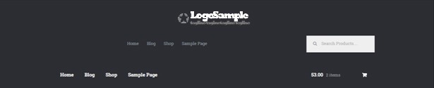
Applying the CSS code above will result to this. Now, the only thing left to do is to resize the search box using CSS.

Adjust width of main navigation for search box to un-warp around the bottom

Putting Everything Together

Put everything inside the media screen brackets, together with the CSS code for the resizing of the search box. The final CSS code will be:

@media screen and (min-width: 768px) {
	/*centers the logo*/
	.site-branding{
		text-align: center;
		margin: 0 auto !important;
		float: none !important;
	}
	/* adjusts the width of the main navigation container to accommodate the search box in the same line*/
	.woocommerce-active .site-header .main-navigation {
		width: 50%;
	}
	/* positions the search icon properly in the search box*/
	#masthead .site-search .widget_product_search form:before {
		top: 1.75em;
		left: .75em;
		position: relative;
	}
	/*  resizes the search box*/
	#masthead .site-search .widget_product_search input[type=search],#masthead .site-search .widget_product_search input[type=text] {
		padding: .5em .5em .5em 2em;
		line-height: 1;
	}
	/* places the search box to the left of the cart menu(optional)*/
	.woocommerce-active .site-header .site-search {
		float: left;
	}

}

And you’re done. The outcome should look something like this.

Storefront Center Logo_Final

If you are unable to achieve this with the above code snippets, it could be that you are using a child theme that has codes that conflict with the codes above. Feel free to post your questions in the comments section.

People that read this article also liked

internet-characterHow to Create a Child Theme for Storefront How to Rename Primary Menu in Mobile View for Storefront Theme How to Remove Horizontal Line under Page Title in Storefront Theme How to Change the Arrows in Pagination for Storefront and WooCommerce

Filed Under: Code Snippets, How-To Articles Tagged With: code snippet, CSS, design tweaks, how-to, mobile friendly, Storefront, WooCommerce, WordPress

Comments

  1. Alex says

    May 21, 2016 at 5:21 am

    I got to the step where you add this code:

    /*adjusting the width of the main-navigation*/
    .woocommerce-active .site-header .main-navigation {
    width: 50%;
    }

    But adding this code didn’t make any difference. The Search Bar was still warped around the bottom, and pushed to the right. Just like it was after the previous step.

    So I tried deleting the code I had added and inserted the “Putting Everything Together” Code:

    And now my search bar is down below and pushed to the left. How can I fix it to look like yours?

    please see: http://ProSkateShop.com

    Reply
    • Rob says

      May 23, 2016 at 7:04 am

      There was an update to Storefront recently which is Storefront 2.0.

      They’ve updated the header hook index so paste this to your functions.php instead.

      add_action( 'init', 'jk_remove_storefront_header_search' );
      function jk_remove_storefront_header_search() {
      remove_action( 'storefront_header', 'storefront_product_search', 40 );
      add_action( 'storefront_header', 'storefront_product_search', 55 );
      }
      
      Reply
      • Alex says

        May 24, 2016 at 11:45 pm

        Rob,

        Hi, thanks for your response! I wasn’t sure if I should paste this into my functions.php in addition to the css edits provided in the article above, or if I should ignore those css edits, and just paste this into the functions.php… Can you please specify that?

        Also, my functions.php files says:
        * Note: Do not add any custom code here. Please use a custom plugin so that your customizations aren’t lost during updates.
        * https://github.com/woothemes/theme-customisations

        I tired adding your code there, and it crashed my site, so I deleted that code and my site back back up again.

        I checked that github url and it lead me to the “theme-customisations” plugin.. perhaps I should use this to make the edits to the functions.php?

        Also, is a child theme necessary to make these edits? Or is there a free plugin that might make the whole process much easier?

        Reply
        • Rob says

          May 25, 2016 at 6:38 am

          Hi Alex,

          We recommend using “My Custom Functions” plugin. Just paste the code there and you’re good to go.

          And yes, this is another step in addition to the edits to your style.css file. It would look like this in the admin panel. http://prntscr.com/b853wi

          A child theme is not necessary but having a child theme is beneficial. Check out this other post: https://wooassist.com/how-to-create-a-child-theme-for-storefront/

          Reply
          • Alex says

            June 1, 2016 at 3:47 am

            Hi Rob, thank you so much for your responses, and all of your help. Unfortunately, my site looks like this: http://ProSkateShop.com (I will leave it as is for a few days so you can see and get back to me.)

            Here’s what’s in my “Edit CSS” link (I’m using JetPack)

            @media screen and (min-width: 768px) {
            	/*centers the logo*/
            	.site-branding {
            		text-align: center;
            		margin: 0 auto !important;
            		float: none !important;
            	}
            	
            	/* adjusts the width of the main navigation container to accommodate the search box in the same line*/
            	.woocommerce-active .site-header .main-navigation {
            		width: 50%;
            	}
            	
            	/* positions the search icon properly in the search box*/
            	#masthead .site-search .widget_product_search form:before {
            		top: 1.75em;
            		left: .75em;
            		position: relative;
            	}
            	
            	/*  resizes the search box*/
            	#masthead .site-search .widget_product_search input[type=search],#masthead .site-search .widget_product_search input[type=text] {
            		padding: .5em .5em .5em 2em;
            		line-height: 1;
            	}
            	
            	/* places the search box to the left of the cart menu(optional)*/
            	.woocommerce-active .site-header .site-search {
            		float: left;
            	}
            }
            

            AND HERE IS WHAT’S IN MY Functions.php USING THE “My Custom Functions” PLUGIN.

            /* Enter Your Custom Functions Here */ 
            add_action( 'init', 'jk_remove_storefront_header_search' );
            function jk_remove_storefront_header_search() {
            remove_action( 'storefront_header', 'storefront_product_search', 	40 );
            add_action( 'storefront_header', 'storefront_product_search', 	70 );
            }
            

            I FEEL REALLY THANKFUL THAT WOOASSIST IS HELPING ME TROUBLESHOOT MY WEBSITE. THANK YOU FOR SHARING YOUR KNOWLEDGE WITH CLARITY, CUZ I NEEDED SOME REAL PROS TO HELP ME FIX THIS.

          • Joverly Dela Costa says

            June 7, 2016 at 7:13 am

            On the last line of your functions.php, update the line:

            add_action( ‘storefront_header’, ‘storefront_product_search’, 70 );

            to

            add_action( 'storefront_header', 'storefront_product_search', 55 );
  2. Annie says

    September 14, 2016 at 9:28 am

    Hi,

    I am looking for a way to hide the header background image when it goes to mobile view in Storefront. Is there some code I could use to make that happen please?

    Reply
    • Nick J says

      October 4, 2016 at 4:31 pm

      Yes, there is a CSS code for that. It will involve media screen query to define the screen size that you want your CSS to exclusively work with. If you can share a link to your site, we can help you with the exact CSS.

      Reply
  3. Kim says

    November 10, 2016 at 6:44 pm

    I am trying to get my logo plus navigation bar centered but I can’t get it to work. I have added the following code to style.css but it doesn’t change anything on my page. Can you please tell me what I can do to fix it?

    @media screen and (min-width: 768px) {
    	.site-branding{
    		text-align: center;
    		margin: 0 auto !important;
    		float: none !important;
    	}
    }
    
    Reply
    • Nick J says

      February 13, 2017 at 7:20 pm

      Hi Kim, please do share the URL of your site so that we can help you with the exact CSS you need.

      Reply
  4. Carol says

    December 16, 2016 at 4:49 pm

    Hi, thanks for this! It works great! Is there something I can add to center my menu?

    Reply
    • Nick J says

      February 13, 2017 at 7:16 pm

      Hi Carol! You just need to set the width of the menu to 100%. Then add text-align:center to it. If you share us a link of your site, we’ll see what we can do.

      Reply
  5. Greg says

    December 18, 2016 at 12:28 am

    Thanks for the tip, It worked well for me, but I’m trying to center tha logo on the mobile version and I’m stucked, please help me with that, you are my only hope. Thanks

    Reply
    • Nick J says

      February 13, 2017 at 7:15 pm

      Hi Greg! Can you share us a link of your site so we can see what is happening?

      Reply
  6. Arnau Devesa Morales says

    February 22, 2017 at 6:13 pm

    Hi Nick!

    I am pretty new in the WordPress world and I’m struggling on how to:
    – Center the logo
    – Resize the logo (I’d like to have it much bigger than it’s)
    – Center the menu bar (Inicio, Tienda, etc…)

    After searching the whole day on the Internet and trying to write some code I’ve seen on some forums (including yours) I’m afraid I need your help.

    This is my site: http://www.miminimundo.com

    Any help would be appreciated!

    Thanks a lot 🙂
    Arnau

    Reply
    • Nick J says

      March 31, 2017 at 6:57 am

      Hi Arnau,

      You can try adjusting the size of the logo using this code. Try to use different values for the width.

      .site-header .site-branding {
         width: 80% !important;
      }
      

      As for centering the menu bar, not sure about your issue. You can try our plugin, https://wordpress.org/plugins/storefront-header-picker/

      Hope it helps.

      Reply
  7. Mario says

    September 15, 2017 at 6:43 am

    Hello,

    I ask your help to reproduce the format of the header of my site with storefront like this website http://www.easycash.fr by adding three buttons just at the bottom of the form search:

    Thank you in advance.

    Reply
    • NickJ says

      October 10, 2017 at 3:15 am

      Hi Mario,

      If you require custom development on your site, you may purchase a support package. Please see the link below to our pricing page:

      https://wooassist.com/pricing/

      For any other questions, please send us an email at [email protected]

      Reply
  8. Dayle says

    November 25, 2017 at 7:15 am

    Hi,

    I have tried this same method inside a media query to center my logo, menu, and a couple of extra divs for mobile and nothing seems to be moving. Any ideas?

    Reply
    • Rob says

      April 10, 2018 at 3:39 pm

      Hi Dayle,

      Can you link us to your site so we can see what is happening?

      You can also email us at [email protected].

      Reply
  9. Marie says

    January 25, 2018 at 3:20 pm

    Thank you for this tutorial, it works great !
    Just do you know how to change the toggle button menu breakpoint ? With this new header, my primary menu sets on 2 lines on devices like Ipads.
    Thank you.

    Reply
    • Robelle Tan says

      April 19, 2018 at 2:07 pm

      Hi Marie,

      Could you link us to your site so we can check how it behaves?

      Reply
  10. Ff says

    February 2, 2018 at 3:15 pm

    Hi
    Followed all instructions and it’s perfect except the logo is a little to the left for some reason! Any ideas?

    Reply
    • Robelle Tan says

      April 10, 2018 at 3:13 pm

      Hi Ff,

      It may be an issue with your image or a custom style that has been added to control the position of the image. Try to do an inspect element and adjust the image by adding margin/s.

      Reply
  11. Erica Johnson says

    April 15, 2018 at 7:48 pm

    Thanks for this tutorial! I was able to center the logo on a woocommerce site in a matter of minutes! The site is landlmommyandme.com. It’s still a work in progress 🙂

    Reply
    • Rob says

      April 19, 2018 at 2:30 pm

      Hi Erica,

      Glad to know this post helped you out.

      Reply
  12. Kartikeya says

    May 1, 2018 at 9:59 pm

    Hi Rob, Nick,

    Thanks so much:) I love Wooassist’s plugins and this helped me center the logo for the desktop version. But unable to do the same for mobile. I even removed and (min-width: 768px) from your suggested code. It finally reads:

    @media screen {
    	.site-branding{
    		text-align: center;
    		margin: 0 auto !important;
    		float: none !important;
    	}
    }
    

    Can you please help me center the mobile logo as well?

    Reply
    • Rob says

      May 12, 2018 at 2:30 am

      Removing this bit ‘(min-width: 768px)’ will apply the styles on the desktop version. That bit you removed is the instruction that the styles will be applied to that specific screen size. The code we provided in the post should do the trick but if it does not center the logo on mobile view, then there may be conflicting styles that override our code. If you can provide a link to your site, we can take a quick look.

      Reply
      • Kartikeya says

        May 15, 2018 at 5:42 pm

        Hi Rob, you’re right. Another plugin (Max Mega Menus) was conflicting the mobile styling. Found a workaround now and learnt some CSS on the way too.

        Reply
  13. Matt says

    May 13, 2018 at 4:08 pm

    Hey, many thanks for the guide!

    On mobile the logo is still off to the left on my site (everything works great on desktop).

    Any chance you could take a look and see where I’m going wrong?

    http://www.blankarchive.com/

    Reply
    • Rob says

      May 14, 2018 at 2:05 pm

      Hi Matt,

      In your case, you might be using another plugin for the site-branding. You can replace the CSS from the guide to the one below. This will also center the dropdown menu to balance the layout.

      @media screen and (min-width: 768px) {
      .woocommerce-active .site-branding {
          float: none;
          text-align: center;
      }
      
      button.menu-toggle {
          display: block;
          margin: auto;
          float: none;
      }
      }"
      
      Reply
  14. Matt says

    May 13, 2018 at 4:30 pm

    Also, is there any way to have the resized search box on the same line as the logo (but set off to the right) as shown here:

    https://i.imgur.com/79l3jpH.png

    Reply
    • Rob says

      May 14, 2018 at 2:14 pm

      Hi Matt,

      I’m afraid not. Centering the logo sets the logo width to 100% so no items could be placed beside it. This is achievable but not using this guide. It will need to be set up differently. Besides, if you put the search bar on the same line, there will be no balance in the layout as there will be a lot of white space to the left of the logo.

      Reply
  15. Travis Matthews says

    June 11, 2018 at 9:18 pm

    Trying to get my navigation and search bar to centre vertically with my logo but adding padding in the customize options doesn’t seem to help. Any idea where I’m going wrong?
    http://www.biggusjuice.com.au

    Reply
    • Rob says

      June 26, 2018 at 12:03 pm

      Hi Travis,

      Adding this to your custom CSS section should fix it:

      .sp-header-active .sp-header-span-3 {
      	width: 21.7391304348%;
      	float: left;
      	margin-right: 4.347826087%;
      	padding-top: 100px;
      }"
      
      Reply

Leave a Reply Cancel reply

Your email address will not be published. Required fields are marked *

Woocommerce Support

wooassist-team-in-Iloilo

Get 2 Hours of
FREE SUPPORT

We are so confident that you will love our services that we will give you your first 4 hours at a 50% discount

That's 4 hours for only $75

BUY NOW

Happy Wooassist Customers

Awesome! Fantastic! I just went to our site and I see that our site has been fixed!! We are getting orders again thanks to you all at WooAssist! Our site has not worked and looked this good for many months!! You all are awesome! Thank you so much for fixing our site! You have a customer for life! Thanks for making my day wonderful!

Kenneth Arnold

We have been quite pleased working with WooAssist as they help fill in the gaps of our development needs, all at a great price. They are always timely and communicate great, I highly recommend their services.

James Grasty

My husband and I am EXTREMELY pleased with the WooAssist Team. They provide excellent service, are very knowledgeable, and super easy to communicate with. The team ALWAYS has our company's best interests in mind. I love WooAssist! All of you make my job easier.

Jennifer Taft leetaft.com

Categories

  • Code Snippets
  • How-To Articles
  • Interviews
  • SEO For E-Commerce
  • Theme and Plugin Reviews
  • Wooassist News
  • WordPress/WooCommerce News

Recent Posts

  • The Ultimate Guide on How to Set Up Shipping on Your WooCommerce Store
  • WordPress Site Gets Infected
  • Where to Hire a WooCommerce Developer?
  • Recent Spike in Attacks Targeting Outdated WordPress Plugins
  • Security Vulnerability in Spam protection, AntiSpam, FireWall by CleanTalk
Let us support your online store so you can manage your business

Get started today

Get 2 Hours of FREE SUPPORT

We are so confident that you will love our services that we will give you your first 4 hours at a 50% discount

That's 4 hours for only $75

BUY NOW

Free eBook

Your subscription could not be saved. Please try again.
Your subscription has been successful.

YOURS FREE!

5 Things Every Online Store Can Fix On Their Website In The Next Week To Increase Sales

Quick Links

  • How it Works
  • Pricing
  • Blog
  • Contact
  • About Wooassist
  • My Account
  • Checkout
  • Privacy Policy
  • Cookie Policy
  • Terms and Conditions

Wooassist

Australia:
8 Storie St.
CLONTARF QLD 4019

Philippines:
San Miguel St.
Poblacion, Iligan City 9200

Connect

  • Facebook
  • LinkedIn
  • Twitter
  • YouTube

Copyright © 2023 · Wooassist

Yours FREE!

5 Things Every Online Store Can Fix On Their Website In The Next Week To Increase Sales