 As part of your sales funnel, your goal probably is to convert site visitors into subscribers and later on, into paying customers. Email marketing is still one of the best means to connect with your potential customers after they’ve left your site. As you get visitors in your WooCommerce store, you’ll want to get their emails. To do this, you need to learn how to optimize email opt-in forms.
In this post, we’ll show you what you should put in an opt-in form and how to position it strategically on your e-commerce store. We’ll also introduce you to some popular WordPress plugins to easily add opt-in forms on your site.
Where can You Add Opt-in Forms?
It is useful to add opt-in forms in different sections and pages on your e-commerce store.
Landing page
Using a landing page (or a squeeze page) is the traditional method of collecting leads. Because your goal is to get people to sign up to your mailing list, every element of the landing page should support that desired action. Don’t add a side-bar because it will just distract the users from the real goal. Remove links that will take the site visitor away from the landing page before they even fill out and submit the opt-in form.
Feature Box
A feature box is a full-width email opt-in box usually added on top of your homepage. Some do not use a feature box because of two things: it takes up the most valuable space on your homepage, and it seems pushy to immediately ask for an email address. To validate the feature box’s location and avoid getting negative attention from site visitors, make sure that what you’re offering is definitely useful in exchange for their email address.
As an example, the use of a feature box on DIYthemes’ blog resulted in a 51.7% increase in its daily blog subscription.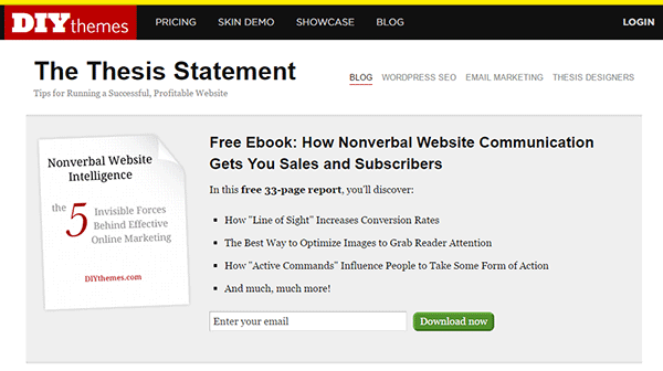
Pop-up Window
Because of its nature of ‘popping-up’ and interrupting the user while browsing the site, many visitors don’t like pop-ups. Nevertheless, a pop-up window is still one of the most effective lead generation tools. A lightbox works the same way as a pop-up window, but the rest of the site is darkened to make the form stand out.
Note that the timing should be perfect to avoid hindering good user experience. Once seen, you have only 1-2 seconds to grab the user’s attention and pique their interest before they close the window. Here are some examples of high converting pop-up email forms.
Opt-In Forms in Other Pages
 Apart from the feature box in the homepage, you can insert more opt-in forms in other pages (About page and Splash page) and in other page sections (top of sidebar, sticky top bar and below the footer).
The About Us page is usually one of the most visited pages in any website, so it’s a good idea to make the most of that traffic.
In a Kissmetrics review, using a splash page might be a better idea than a pop-up on the homepage. A pop-up is frowned upon because it interrupts the user while browsing the site. A splash page appears as a preliminary message. As such, it is better perceived.
Sidebar Opt-In Form
A sidebar opt-in form is the most common email list building method mainly because it is built in to most website templates. Keep your opt-in form to the top of your sidebar though, to maximize results.
Sticky Top Bar
Because a sticky top bar remains visible on top of the page even as you scroll down, visitors have plenty of time and opportunity to notice the message and eventually subscribe.
Components of an Opt-In Form
Once you’ve determined where you want your opt-in forms, the next step is to create them. To increase your chances of getting sign-ups, your opt-in form should have the right timing, design, form fields and copy.
Timing
 In using a pop-up window, you need to properly time it. You can set a time delay before showing the pop-up. If it’s too early, you’ll annoy site visitors even before they’ve taken a look of your site and what you have to offer. A 15-second delay is enough time for visitors to look around your site and not be too bothered with a pop-up. Note that this does not necessarily apply to your target audience. It’s best to conduct your own tests.
You can also show pop-ups as visitors reach the bottom of your content or as they exit your site.
Design
To effectively connect with your visitors as they quickly scan your opt-in form, you need to add visual elements that enhance your messaging. Humanize your opt-in form with a photo. Inject credibility with a testimonial or statistic. If your opt-in form is not a pop-up, make sure it will get noticed but at the same match your site’s theme.
Form Fields
More people sign up when less form data is requested. Note that you just need the email address of your site visitors for email marketing purposes. Usually just a name and email in the form will suffice. You can even make the name optional.
Concise Copy
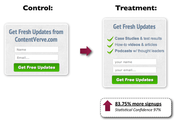
Make your opt-in form copy as concise as possible. It’s important to present a clear purpose when asking for personal information. Spell out what your site visitors will get in return. You can also assure them that you won’t sell their addresses to a third party or spam them. BeemDigital showed an 83.75% increase in sign-ups when they added value and relevance to their opt-in form.
Another effective tactic is to offer a lead magnet, like a free e-book, product trial, discount, or even free shipping. On a side note, you can set up the incentive in such a way that your new subscribers won’t unsubscribe immediately. If you’re offering a free e-book, break it up in parts and offer them in a series of emails. Entice them to want to wait for what’s coming next.
Recommended Opt-In Form Plugins for Your WooCommerce Store
In choosing your opt-in plugin, consider what features you need and choose a plugin that provides just that and nothing more. Anything more is just extra bloat on your site. Below we list some of opt-in form plugins that we can recommend.
OptinMonster
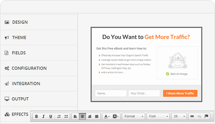 OptinMonster is a paid pop-up plugin that offers a wide range of functionality. It comes with an easy-to-use form builder that allows you to create various types of opt-in forms including WordPress popup forms, floating header and footer bars, slide-ins also known as scroll triggered boxes, sidebar forms, after post forms, in-line forms, mobile-specific forms, and welcome gates. Other features are exit-intent technology, page-level targeting, behavior automation and A/B testing, and a 2-step opt-in process.
PopupAlly
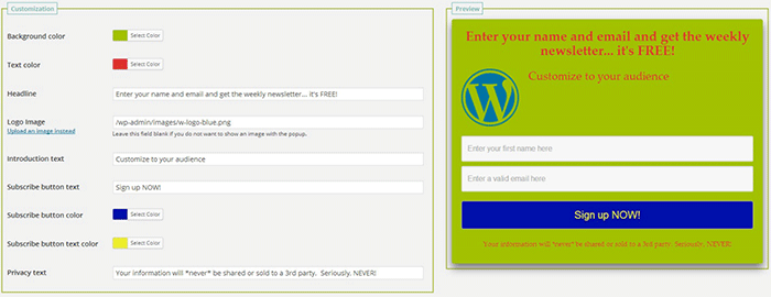 PopupAlly’s free version allows you to create advanced popup signup forms even if you don’t know how to code. You can also embed opt-in forms at the bottom of your posts, set a few seconds’ delay or have the pop-up appear as the users leave your site.
Its premium version, PopupAlly Pro, has an optimized interface and extra features. This includes more customizable templates, more opt-in options (horizontal, sidebar, below-the-post, etc) and allows for any web fonts to be used. Click-based and scroll activation timing features and one-on-one email support are available only with the premium version.
Hello Bar
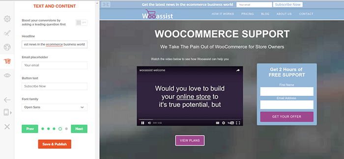
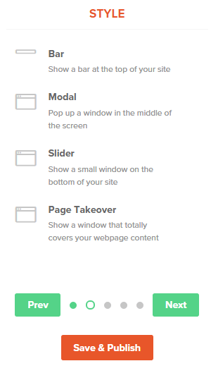 Hello Bar is a free plugin that allows you to copy and paste a code snippet from HelloBar.com straight to your WordPress admin interface. Above is the HelloBar interface from the website. You can choose from several goals like grow your email list, promote your social pages, promote an offer, or add a contact form. You can choose from several styles of opt-in forms and even change the colors to match your website’s colors. To set up HelloBar, just visit the site to configure. The interface is very straight forward so you should have the design in minutes. To apply this to your site, just install the free plugin that is generated specifically for your website. This plugin will only work for the site that you registered it for. You can just create a new one for another site.
This plugin also comes with A/B testing so you can easily optimize for increased conversion.
Ninja Forms
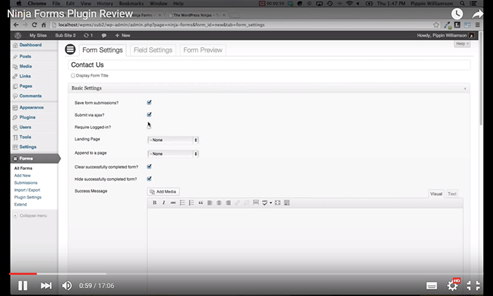 Ninja Forms is a plugin built with developers in mind. Included are hundreds of functions, action hooks, and filters that developers can use to create their own custom functionality. Customize field options and forms with its extensive settings. Add a Ninja Form to your e-commerce site easily with a widget, shortcode, template function, or append it automatically to any content. Upgraded bundles include automatic updates, add-ons and sites per add-on, and email support with faster response time.
Which Opt-in Forms Leads to More Conversions?
 There is no single correct answer to this question. Different websites vary in terms of design and market. This article could help point you in the right direction, but there are a lot of things you need to figure out for yourself. Get to know your customers by creating a customer persona. When you are able to identify your customers, you’ll know how to market to them. From there, you can create a sales funnel that works for you. Use heat maps like CrazyEgg to find out where your visitors click. Constant A/B split testing will help you determine what variation converts better.
Conclusion
Opt-in forms should be placed strategically throughout your website. Optimize them so they are easily visible. Make them stand out. These forms should offer value and relevance to encourage users to subscribe. Enhance copy with visual elements and keep form fields to a minimum. If you decide to use pop-ups, you need to time them correctly so as not to be intrusive. Make sure you’re getting the most of your opt-in plugin’s features without sacrificing site performance. When your opt-in forms are set up, you need to conduct your own split testing to optimize for maximum conversion.
Hope this article helped you out. Do you have any strategies you’d like to share for increasing opt-in form conversion? Do you want to add something that we might have missed? Let us know in the comments section.




Leave a Reply