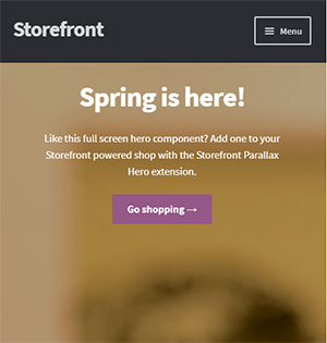
Over the last few years, optimizing for mobile devices has become increasingly more important. More and more users browse the internet using their phone. According to Statista, 52.2 percent of web traffic comes from mobile phones and it has only been increasing from the previous years. As a WooCommerce store owner, you must optimize your website for conversion on these smaller screen sizes. Learn how to increase mobile conversion rates for your WooCommerce store by following the tips below.

How to Optimize Your WooCommerce Store for Mobile Devices
Use a Responsive Theme

All modern themes are now built to be responsive. A responsive theme adjusts to various screen sizes. You can check with your theme developer if your theme is responsive. You can also do a quick test by going to your WooCommerce store and then try scaling down the size of your browser. If you see the elements on your website move to adjust to the smaller window, then you are using a responsive theme. If you find that your theme is not responsive, don’t worry. You can switch to a responsive theme. We can recommend Storefront and the Genesis framework.
Storefront was made by the same developers that developed WooCommerce. It is built specifically for WooCommerce so you can expect full compatibility with WooCommerce and official WooCommerce plugins.
Genesis, on the other hand, is a framework. You need to use a Genesis child theme with the Genesis framework. Genesis is well-maintained, responsive and compatible with WooCommerce.
User Test Your Mobile Site
Open your WooCommerce store on your smartphone and do some user testing. Perform actions that you expect your customers to do on your WooCommerce store. Important elements to test are:
- making a purchase
- subscribing to your newsletter
- sending a message using your contact form
- filling out the checkout fields
- updating your shopping cart
- commenting on blog posts
- tapping on call-to-action buttons
There may be more that you need to test that is specific to your website. Take note of any difficulties that you encounter and get them fixed. Should you need help fixing any issues, the Wooassist team can help.
Use White Space and Large Fonts

Don’t skimp on using white space on your mobile site. Use it to your advantage. Since mobile devices have small screens, it makes it hard for the user to navigate or read your site if the elements are too close together. Also, make sure your site is easy to read by increasing font size.
Optimize Your Checkout Page
Your checkout page is one of the most important pages on your website. Limit your checkout form fields to only the necessary details. Remove any distractions to completing checkout. Make sure that the form fields are tall enough that they are easy to tap and fill out. Make the checkout button large enough so it is easy to tap. Don’t make the checkout process a burden to your customers.
Remove AutoPlay Videos and Pop-ups

Pop-ups and autoplay videos are annoying for desktop sites. Even more so on a mobile site. Don’t burden your customers with extra data charges from autoplay media. In some cases, these elements may be necessary. But if they don’t help you increase your sales, consider removing them. Instead, focus on making your customers click on your call-to-action buttons.
Improve Your Site Speed
Site speed has become very important as it is now a ranking factor for SEO. On the mobile platform, site speed is critical with mobile data speeds being slower than a wired internet connection. If your mobile site takes too long to load, the user will just leave. There are a lot of tools at your disposal to determine how you can improve your site speed. Google PageSpeed Insights even shows recommendations specific to your mobile site. Other tools that we can recommend are GTmetrix and Pingdom Website Speed Test.
Optimize Your Images
This is related to site speed but deserves its own section. Many WooCommerce store owners neglect optimizing images and just upload willy nilly. If you upload large images without optimizing them, your mobile conversion rates would take a hit. You can use a plugin to optimize the images you’ve already uploaded. However, if you’ve uploaded images that have dimensions bigger than the image placeholders, they will need to be manually optimized. If you’ve been doing this for years, then you’ve got a big task ahead of you. To manually optimize images, you can follow the instructions in this blog post.
Optimize Your Site Navigation on Mobile

Poor navigation can make or break a mobile website. Make sure that your mobile website is easy to navigate otherwise your customers will leave your site out of frustration. Use a hamburger menu. If you are using a responsive theme, the hamburger menu should be built in. If not, you can custom code your mobile menu or use a plugin.
Offer Multiple Payment Gateways
It is important to offer the payment gateway that your customers prefer. On the mobile platform especially, depending on your location, mobile wallets are a thing. If you can tap into that market, you can improve your conversion rate. For iPhone users, there’s Apple Pay which you can enable on WooCommerce.
Just follow all the tips above to increase your mobile site’s conversion rates. If you have any tips that you can add or any questions at all, let us know in the comments.


Leave a Reply