Wooassist

Assistance for Your Woocommerce Store

  • How it Works
  • Pricing
  • Services
    • Site Maintenance
    • AI SEO and Content Marketing
  • Blog
    • How-To Articles
    • Code Snippets
    • SEO For E-Commerce
    • Theme and Plugin Reviews
    • Wooassist News
    • WordPress/WooCommerce News
    • Interviews
  • About Us
  • Contact
You are here: Home / Archives for design tweaks

How to Rename Primary Menu in Mobile View for Storefront Theme

February 26, 2015 By John 6 Comments

Updated 18/2/16 : Storefront Theme was updated. Adding a filter hook to rename the navigation.

Rename Primary Menu in Mobile View for Storefront Theme
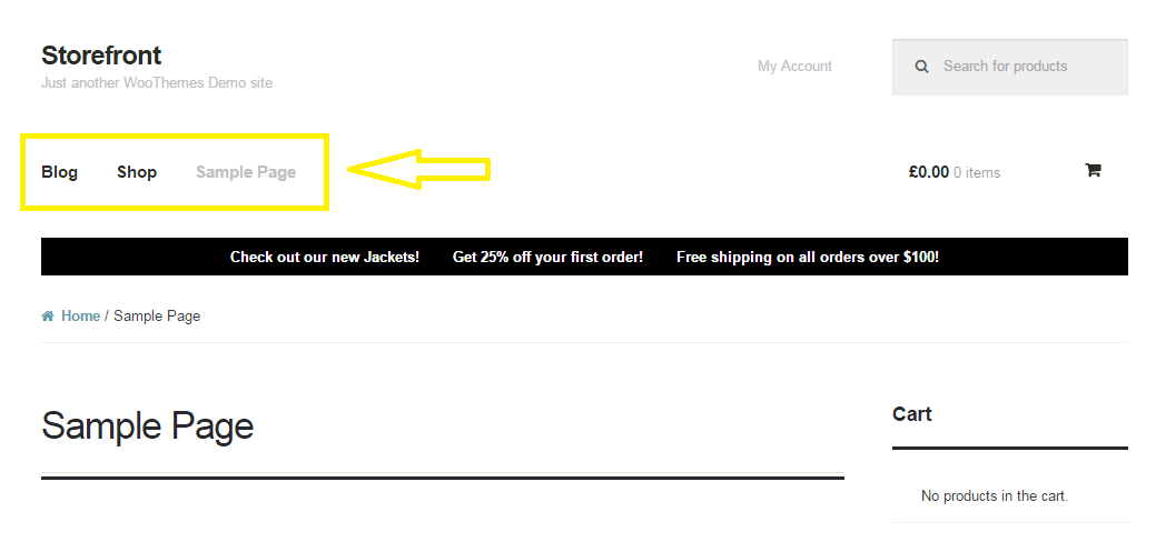
If you have donned the Storefront Theme by WooThemes and tested the mobile view, you might have noticed that your main navigation/menu turns into a collapsible menu. While this menu does serve its purpose in the mobile view, it being named “Primary Menu” isn’t very desirable. You most likely need to change it to something more appropriate for your needs.

Different websites have different navigations so from the theme developer’s standpoint, putting in a not very descriptive text like “Primary Menu” will serve its purpose just fine. But for a website owner like you who knows what he wants, you’d want something more specific for that mobile collapsible menu. Maybe you’re selling your own line of apparel and your menu is filled with different product categories, so you want the text to be something like “Product Categories”, “Browse Clothing Line” or maybe even make it a call-to-action like “Shop Now” or “Shop Online”. Bottomline, you know what you need the text to be on that mobile collapsible menu. Lucky for you, it’s easy enough to accomplish with a few lines of code.

Get a Child Theme

Before we proceed, make sure you are running your website on a child theme. To begin with, there is really no reason why you shouldn’t have a child theme unless you want any changes you made to your theme to disappear whenever the theme updates. If you don’t have a child theme yet, get one.

Add the Filter

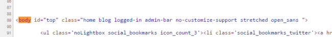
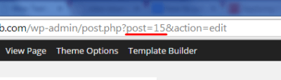
Now that you have a child theme, paste this code into your child theme’s functions.php file.

add_filter( 'storefront_menu_toggle_text', 'jk_storefront_menu_toggle_text' );
function jk_storefront_menu_toggle_text( $text ) {
 $text = __( 'MY NAVIGATION' );
 return $text;
}


Change the Text

Do you see the line with the following code?

$text = __( 'MY NAVIGATION' );

You’ll just need to modify the text “MY NAVIGATION” and change it with the text that you want on your collapsible mobile menu.


Filed Under: Code Snippets, How-To Articles Tagged With: call-to-action, child theme, code snippet, design tweaks, how-to, mobile friendly, navigation, responsive design, Storefront, woothemes

How to Remove Horizontal Line under Page Title in Storefront Theme

February 26, 2015 By John 2 Comments

Updated 18/2/16 due to Theme Update

For one reason or another, you might find that you’d like to remove that horizontal line just below the page title in Storefront theme. The horizontal line becomes prominent when you don’t have a title for your page which could happen on home pages.

Remove Horizontal Line under Page Title in Storefront Theme
That line that the arrow is pointing at.

To remove the horizontal line, simply add the code below to your child theme Styles.css file.

.page-template-template-homepage-php .hentry .entry-header, .page-template-template-homepage-php .hentry .entry-header h1 {
 border-bottom: 0;
margin-bottom: 0px;
 }

The code “margin-bottom: 0px;” is necessary to remove the bit of extra spacing below where the line used to be.

Now you know how to remove horizontal line under page title in Storefront Theme but if that doesn’t fix your problem, let us know in the comments.

Filed Under: Code Snippets, How-To Articles Tagged With: code snippet, CSS, design tweaks, how-to, Storefront, woothemes

How to Move the Navigation Menu Outside of Header for Storefront

February 26, 2015 By John 9 Comments

Here’s another tweak that you can do on the Storefront theme.

Move the Navigation Menu Outside of Header

If you want to move the main navigation/menu below or outside the header, you just need a few lines of code. There is no need to create a new header.php file on your child theme. Instead, just add this piece of code to your child theme’s functions.php file and you’re all set.

function child_theme_init() 
{
remove_action( 'storefront_header', 'storefront_primary_navigation', 50 );
add_action( 'storefront_before_content', 'storefront_primary_navigation', 5 );
}
add_action( 'init', 'child_theme_init' );

Before you do this, do know that it’s not really recommended to move the styles outside of its original location. After doing this, you will need to redo all the menu styles and that’s a lot of work.

Now you know how to move the navigation menu outside of header for storefront theme. Hope this worked for you. If not, feel free to post a comment and we’ll see what we can do to help you out.

Filed Under: Code Snippets, How-To Articles Tagged With: code snippet, design tweaks, how-to, navigation, Storefront, woothemes

How to Specify CSS Styling on a Single WordPress Page  

March 5, 2015 By John Leave a Comment

Understanding a bit of CSS is a useful skill for a website owner. Now, suppose you wanted to apply a line of CSS styling on just a single page instead of the entire site. Learning how to target your CSS to specific pages can solve hours of frustration when a code snippet isn’t readily available on the internet.

Let’s use this example: we’re going to hide the page title of just the Home Page.

The basic CSS for hiding a page title will usually look like this:

.main-title {
display: none;
}

When you copy the code above and place it in your styles.css file, it should hide all the page titles in the website. Normally, we’d stop there if that was what we wanted but we just want to hide the page title on the home page.

Basically, the code right now is targeting the display attribute for the main-title element. There is however no indication of which main-title is targeted. Is it the main-title on the home page? Is it the main-title on the About page? For cases like these, all main-titles will be affected.

To target a specific page, you need to add another selector and it looks like this:

.home .main-title {
display: none;
}

The “.home” part is the part that indicates which main-title we are targeting.

Now, our next challenge will be figuring out what to write in the “.home” part. For that, we need to look at the page source. Look for the start of the <body> HTML. You will then see something like this:

page-classes

Notice those classes? Those are what we use for the selectors. We can’t just use any of those though because other pages might be using the same classes and if that’s the case, those other pages will be affected by your CSS as well. We have to find the class unique to that page and in this case it is “home”.

On this next example, the unique class which is also the page ID is “page-id-155”. When we make use of “.page-id-155”, we are basically specifying that only that page should be affected by any CSS you write next to it.

page id

However, there are cases where you might have trouble finding the unique class or the page ID is not indicated as one of the classes. In this case, you should go edit that page in the WordPress dashboard. Once you are in the edit page, check out the URL in the address bar. The number corresponding to post= is your page ID that you can then use to target that page.

post id

That’s about it. And do keep in mind that this knowledge isn’t simply limited to your page titles. Here are some more applications:

  • Hiding the widget area for some of your pages.
  • Reducing/enlarging the main content area depending on the current page.
  • Keeping font/color styling on specific pages

When you know the unique class or page ID you can target specific pages with your CSS styling now and I hope it helps you make your website become the best it can be.

Now you know how to specify CSS styling on a single WordPress page. Got questions? Head over to the comments section.

Filed Under: How-To Articles Tagged With: CSS, design tweaks, how-to, website development, WordPress

Choosing a Color Scheme For Your Online Store

March 9, 2015 By John Leave a Comment

Choosing a color scheme for your online storeChoosing a color scheme for your online store might be an arbitrary decision based on your color preferences.

Usually peoples intuition for their color scheme is pretty good. But should you leave it to chance?

Spending a couple hours to learn the theory of color basics is recommended. If it does nothing else it will affirm the decisions you have made based off of your own intuition. But more likely it will or give you some deeper knowledge to craft your color scheme and result in increased sales.

Color Basics

Basically, some colors look good together and some colors don’t.

Through mathematics and the invention of the color wheel we can see patterns of why this might be.

There is a great tool I use called Kuler that lets you choose a color and will then give you other colors that match based on rules you can choose from.

I will show you an example of this soon, but first I just want to discuss what impact choosing a base color will have on your brand.

Emotional Color

Colors have emotional meaning to your visitor and the color scheme you decide on for your brand needs to take this into account. It is no accident that fast food restaurants all use red to make you hungry, and IBM uses its corporate blue to represent trust.

Before you choose a color scheme, here are a few good exercises to identify a personality for your brand.

  • Think of twenty words that describe your brand.
  • If your brand was a car what sort of make would it be?
  • What sort of feelings do you want to be associated with when someone sees your brand?

To learn more about what each color means here is a good article.  http://www.smashingmagazine.com/2010/01/28/color-theory-for-designers-part-1-the-meaning-of-color/

Existing Brand Assets

If you already have a logo then you will often find that the colors you chose were intuitively based on some form of emotional color theory.

If you discover you have chosen incorrectly and it is too costly to update your printed material from the old colors you can leave your logo as is and just add some secondary colors that will give your brand the emotional meaning you were looking for.

A Note on Contrast

Black, white and shades of grey can be used in addition to the color scheme you choose for your site and you can use these to create contrast. Dark colors on light colors and vice versa (light colors on dark colors) stand out more on the page than two colors closer in shade.

You can use this to highlight a particular element on a page by making the contrast of its background greater.

Into Action

To show you an example, I will use the logo from a company Wooassist manages: www.iotagarden.com.au

https://www.dropbox.com/s/k09mmys93n967as/Screenshot%202015-01-09%2012.16.15.png?dl=0

Here are some notes when we re-designed the IOTA site about 12 months ago.

color-1
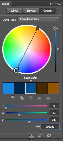
We don’t want to change things too much so we will stick with the two base colors of light and dark blue that are used for the logo. 

I would like to introduce one more color that is a bit brighter and contrasting with the current blues that will liven up the site. 

I am thinking maroon, but we can use adobe Kuler to see what a good contrasting color is mathematically. 

These are the colors from the logo.
Light blue #8da5aa
Dark blue # 005293

Without going too much into the details of how Adobe Kuler works, the end results speak for themselves. When I enter base color dark blue # 005293, the complimentary color was a brown.

color-2
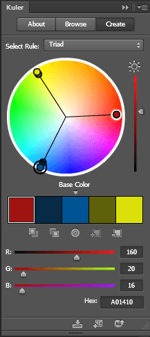
That didn’t suit the objectives of livening the site up so if we look at the triad relationship I can see the magenta color I was originally thinking of #a01410

 And if we look at how these colors look together touching each other and apart you can see Kuler’s maths have not let us down. These colors look great together.

color-3

So here you can see with just a couple hours research and a couple of tools we were able to come up with a color scheme that suited our existing brand assets, while at the same time achieving our new objectives.

What color best represents the feeling of your brand?

Filed Under: How-To Articles Tagged With: colors, conversion optimization, design tweaks, how-to

  • « Previous Page
  • 1
  • …
  • 3
  • 4
  • 5
  • 6
  • Next Page »
Let us support your online store so you can manage your business

Get started today

Get 2 Hours of FREE SUPPORT

We are so confident that you will love our services that we will give you your first 4 hours at a 50% discount

That’s 4 hours for only $75

BUY NOW

Free eBook

5 Things Every Online Store Can Fix On Their Website In The Next Week To Increase Sales

Quick Links

  • How it Works
  • Pricing
  • Blog
  • Contact
  • About Wooassist
  • My Account
  • Checkout
  • Privacy Policy
  • Cookie Policy
  • Terms and Conditions

Wooassist

Australia:
59 Luke St.
Hemmant QLD 4174

Philippines:
San Miguel St.
Poblacion, Iligan City 9200

Connect


Copyright © 2026 · Wooassist

Yours FREE!

5 Things Every Online Store Can Fix On Their Website In The Next Week To Increase Sales