Updated 18/2/16 : Storefront Theme was updated. Adding a filter hook to rename the navigation.
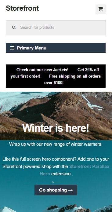 If you have donned the Storefront Theme by WooThemes and tested the mobile view, you might have noticed that your main navigation/menu turns into a collapsible menu. While this menu does serve its purpose in the mobile view, it being named “Primary Menu” isn’t very desirable. You most likely need to change it to something more appropriate for your needs.
Different websites have different navigations so from the theme developer’s standpoint, putting in a not very descriptive text like “Primary Menu” will serve its purpose just fine. But for a website owner like you who knows what he wants, you’d want something more specific for that mobile collapsible menu. Maybe you’re selling your own line of apparel and your menu is filled with different product categories, so you want the text to be something like “Product Categories”, “Browse Clothing Line” or maybe even make it a call-to-action like “Shop Now” or “Shop Online”. Bottomline, you know what you need the text to be on that mobile collapsible menu. Lucky for you, it’s easy enough to accomplish with a few lines of code.
Get a Child Theme
Before we proceed, make sure you are running your website on a child theme. To begin with, there is really no reason why you shouldn’t have a child theme unless you want any changes you made to your theme to disappear whenever the theme updates. If you don’t have a child theme yet, get one.
Add the Filter
Now that you have a child theme, paste this code into your child theme’s functions.php file.
add_filter( 'storefront_menu_toggle_text', 'jk_storefront_menu_toggle_text' );
function jk_storefront_menu_toggle_text( $text ) {
 $text = __( 'MY NAVIGATION' );
 return $text;
}
Change the Text
Do you see the line with the following code?
$text = __( 'MY NAVIGATION' );
You’ll just need to modify the text “MY NAVIGATION” and change it with the text that you want on your collapsible mobile menu.
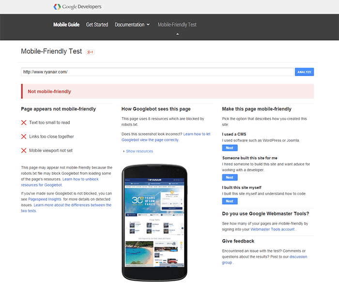
 Google mobile friendly update to penalize non-mobile friendly websites is out. Don’t tell me you didn’t see this coming. As more people used mobile devices to surf the internet, Google had to act. It was only a matter of time before Google started prioritizing websites that are optimized for mobile devices. The new algorithm came into effect April 21.
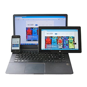 That question is a bit like. “I need a car. How much will that cost?” Of course, the answer is, “It depends”. But to give you an example, we have recently upgraded a few clients themes to the new Storefront theme for between $400-$600.