REVISED 03/04/2020 : Updated stickyheader.js path file
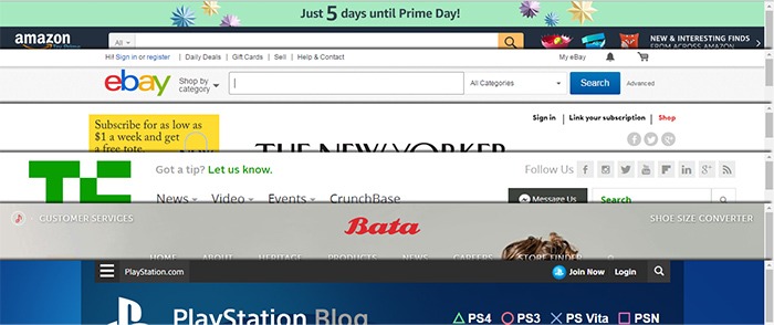
One popular trend in web design today is making the logo and the navigation bar to stick to the top. There are many names for this type of layout. Sticky, floating or persistent headers, and floating navigation are all the same thing.
Developers can “stick” their navigation at the top using simple CSS code. This helps visitors to click on other pages from the navigation menu while scrolling. Here’s how:
Preparation
Before anything else, you should install a child theme on your site. Additionally, you can install customization plugins such as My Custom Functions and Simple Custom CSS. We recommend using these plugins if you are not comfortable working with code as errors can break your site.

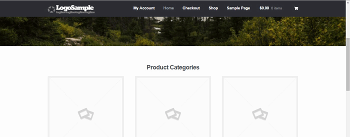
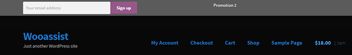
The test site looks like this at the start of this tutorial. In this case, the logo is centered. If you want to learn how to center the logo in Storefront theme, you can check out this post. The search bar and secondary menu was also removed.
Adding the CSS
To make this header layout stick to the top, just paste the CSS code below at the bottom of your style.css file.
#masthead {
		position: fixed;
		top: 0;
		width: 100%;
}
One obvious design pitfall here is that the large default header of Storefront is too big. It gets in the way of the page contents and is too distracting. To solve that, we need to make our header layout smaller first.
We aim to end up with this layout.
To achieve this, we need to do some CSS positioning. The positioning values of the elements depend on the size of your elements. If you have a different sized logo, play around with the height value in the CSS code to move it around. Here is a good article to get familiar with CSS positioning techniques. The code below will position and resize the header elements. It also applies the “position: fixed; top:0;” to the masthead. Paste this to your style.css file.
@media screen and (min-width: 768px) {
  	/*resizing the logo image */
	#masthead .custom-logo-link img {
		width: auto;
		height: 40px;
	}

	/*positioning the main-navigation */
	#masthead .main-navigation {
		text-align: right;
		position: fixed;
		top: 0;
		right: 300px;
		padding: 0;
		width: auto;
	}


	/*positioning the logo*/
	#masthead .custom-logo-link {
		position: fixed;
		top: 0;
		margin: 0;
		padding: 0;
	}
    /*adjusting default margins and paddings*/
    #masthead .site-header-cart .cart-contents{
        padding:1em 0;
    }
    #masthead .main-navigation ul.menu>li>a, .main-navigation ul.nav-menu>li>a {
        padding: 1em 1em;
    }
    #masthead .site-branding{
        margin-bottom: 1em;
    }

	/*positioning the cart-menu */
	#masthead .site-header-cart {
		width: 14% !important;
		position: fixed !important;
		top: 0;
		right: 12%;
		padding: 0;
	}

	/*applying the position fixed on the masterhead */
	#masthead{
		position: fixed;
		top: 0;
		width: 100%;
	}
    /*removing the site search*/
    #masthead .site-search{
        display:none;
    }
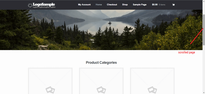
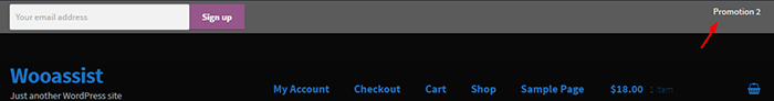
Note that as the page scrolls down, the header stays on top. We have achieved the basic sticky header layout that is not intrusive to the content. It is concise and doesn’t get in the way of the rest of the page.
If you are happy with this, it’s okay to stop here. If you want to take it up to another level, a very common variation of the sticky header is the shrinking header. The shrinking header allows a default full header view when you are at the top of the page. When you start scrolling, the header automatically resizes itself to get out of the way. If you want more coding challenge, read on.
The Shrinking Header
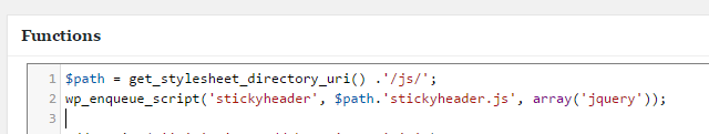
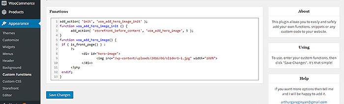
First is to create a js file in your theme’s /assets/js/ folder.
Copy and paste the code below and save it as “stickyheader.js” to the js folder of your theme.
(function($){
	$(document).ready(function () {
		$(window).scroll(function() {
			  if ($(this).scrollTop() > 100){
				jQuery('#masthead').addClass('sticky');
			  }
			  else{
				jQuery('#masthead').removeClass("sticky");
			  }
        		});
	});
})(jQuery);
The code basically says it will add the “sticky” class to the header when you’ve scrolled 100px from the top. Else, it will remove it.
Adding the jQuery file to WordPress
Next step is to tell WordPress to include the JS file you just created. Copy and paste the code below to the My Custom Function plugin.
$path = get_stylesheet_directory_uri() .'/assets/js/';
if (!is_admin()) wp_enqueue_script('stickyheader', $path.'stickyheader.js', array('jquery'));
After this, your JS file will load together with the other js files within your theme. Every time you scroll down, your script will now add the class “sticky” to your header. At this stage, you will not see anything happen yet. This is because we haven’t styled our sticky class yet.
The CSS Code
To style the sticky class, copy this code to your style.css file. Same as before, this is just CSS positioning and resizing. The only difference this time is we attached the “sticky” class on the selectors.
@media screen and (min-width: 768px) {
  	/*resizing the logo image */
	#masthead.sticky .custom-logo-link img {
		width: auto;
		height: 40px;
	}

	/*positioning the main-navigation */
	#masthead.sticky .main-navigation {
		text-align: right;
		position: fixed;
		top: 0;
		right: 300px;
		padding: 0;
		width: auto;
	}


	/*positioning the logo*/
	#masthead.sticky .custom-logo-link {
		position: fixed;
		top: 0;
		margin: 0;
		padding: 0;
	}
    /*adjusting default margins and paddings*/
    #masthead.sticky .site-header-cart .cart-contents{
        padding:1em 0;
    }
    #masthead.sticky .main-navigation ul.menu>li>a, .main-navigation ul.nav-menu>li>a {
        padding: 1em 1em;
    }
    #masthead.sticky .site-branding{
        margin-bottom: 1em;
    }

	/*positioning the cart-menu */
	#masthead.sticky .site-header-cart {
		width: 14% !important;
		position: fixed !important;
		top: 0;
		right: 12%;
		padding: 0;
	}

	/*applying the position fixed on the masterhead */
	#masthead.sticky{
		position: fixed;
		top: 0;
		width: 100%;
	}
    /*removing the site search*/
    #masthead.sticky .site-search{
        display:none;
    }

}
The jQuery script above inserts the sticky class to the master head. We just need to implement the CSS positioning as we did before using the sticky class selector.
For example, our selectors will now be “#masthead.sticky”. We just insert “.sticky” to our selectors so it will only be implemented when we scroll down.
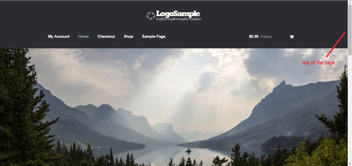
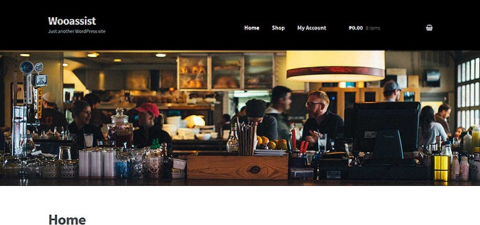
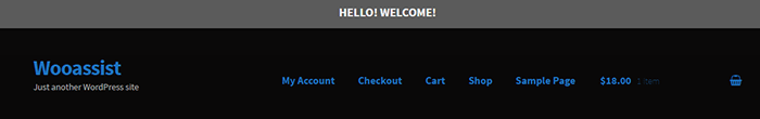
When everything is done, we will be able to see the full header on top of our page.
When scrolling down, the compact header replaces the full sticky header.
We hope you found this tutorial helpful. If you have any questions or if this didn’t work for you, drop a comment in the comments section and we’ll see what we can do.


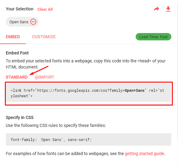
 By default, Storefront theme uses the Helvetica Neue font. This default font is simple and simple is good. However simple may not always fit the design that you are aiming for. You may want to use a different font. But how do you go about changing the theme’s font? In this post, we’ll teach you how to change fonts in Storefront theme using Google Fonts.
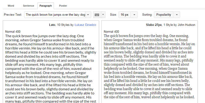
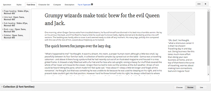
 Let’s break down the difference between Serif’s and Sans-serif type fonts.
 So what font should you use for your WooCommerce store? The correct answer would be a sans serif font and this is true in most cases. However, you should not let this limit your design choices. If you think a serif font will work towards your purpose, then use it by all means.
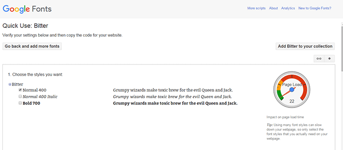
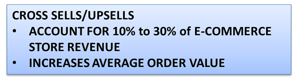
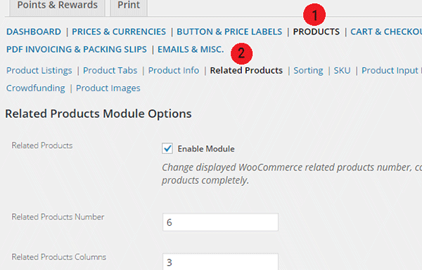
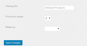
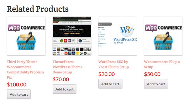 Changing the number of related products in WooCommerce is a relatively easy task if you know how to do it. WooCommerce defaults to two related products in the single product page but store owners may want to show their visitors more than just two related products.