Wooassist

Assistance for Your Woocommerce Store

  • How it Works
  • Pricing
  • Services
    • Site Maintenance
    • AI SEO and Content Marketing
  • Blog
    • How-To Articles
    • Code Snippets
    • SEO For E-Commerce
    • Theme and Plugin Reviews
    • Wooassist News
    • WordPress/WooCommerce News
    • Interviews
  • About Us
  • Contact
You are here: Home / Archives for John

How to Create a Custom 404 Error Page for Your WooCommerce Store

February 25, 2016 By John Leave a Comment

What is a 404 Error

A 404 Error is an error message displayed when an accessed page is not found in the server that you want to access. It is a standard response when an entered address does not match a data from a server.

This happens when you rename, move, or delete a page. This message also appears when the URL is incomplete, mistyped or misspelled. You can change the way your WooCommerce store responds to this error by redirecting or just letting your visitors arrive at a custom 404 Error page.

Creating a Custom 404 Error Page
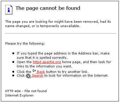
default-404-error-page_screenshot-pngYou can actually just leave it and most websites would just send out a typical text response. So why create a custom 404 error page for your Woocommerce store? A lot of people are highly visual.

Web design is a huge factor in discerning a company’s credibility. Zabisco found out that 40% will respond to visual information better than plain text. This alludes to the importance of creating a visually-appealing custom 404 error page.

Custom content will not only boost your branding but will make customers have a more positive view of your company. Custom content is one of the many reasons that make a customer feel positive about your website.

Statistics/Case Studies on 404 Error Pages

From a search engine ranking standpoint, 404 error pages will not hurt your ranking per se. It only matters when an important link in your site returns a 404 error. This important link could be your “about” page or “contact” page. Your rankings could suffer since these important pages are actually ranking factors.

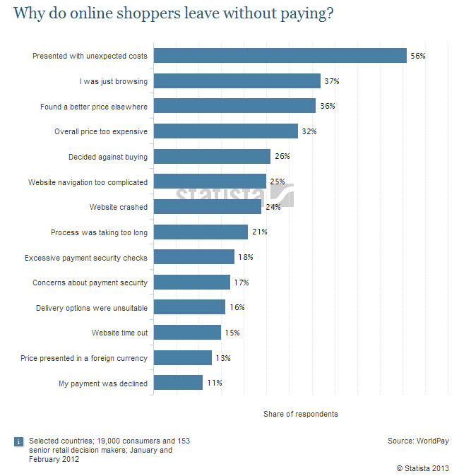
Any other 404 error could also frustrate your visitors and just leave your website. Shopify surveyed why online retailers are losing 67.45% of their sales. They discovered that some of the most common mentioned issues are website problems.
Shopify-survey-why-online-shoppers-leave_screenshot-png

A 404 error also affects a website’s bounce rate. A bounce happens when a visitor comes to your website, does not click on any other page and leaves. Search engines like Google use bounce rate as ranking factor.

A high bounce rate raises several red flags for your WooCommerce store. It may imply poor user experience and your website may be deemed irrelevant to your market.

Elements of a Custom 404 Error Pagelabyrinth

Now before you go and make any changes, keep in mind that each theme is different. There are different ways on how you can create a custom 404 Error page. Here are some important things that you need to consider.

Use Simple Language

A regular site visitor will not understand a typical technical 404 message. Use simple human language to inform your site visitor of what went wrong. You can even use language translations or location specific pages. The goal is to deliver a clear message.

How You Can Help

Apologizing and offering a helpful suggestion should be the main theme. The aim is to change the negative experience from 404 pages into a positive one. You can do this by:

touch-screen_touchscreen

  • Adding a search box
  • Showing your menu navigation
  • Adding a contact, subscription or ticket submission form
  • Adding a sitemap, category lists or key links
  • Linking popular posts or social media accounts
  • Giving out coupons, discounts, or other offers

Time spent in your site should not end in your 404 page. These elements are also engagement and conversion boosters. Your customers stay happy and you get a positive rep.

Examples of Good 404 Error Pages

A lot of huge brands out there appeal to human emotions in their marketing strategy. This is because customers are not buying products, they buy the experience. 404 Error pages in the past are just simple text warnings. Websites now use humor or a bit of personality to communicate their brand to the customers. You can use graphics, animations, or even videos. Here’s some inspiration to get you started.

Popscreen

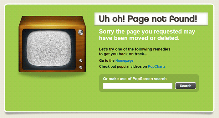
Popscreen showcases a clean and bright but simple and straightforward 404. You can see a link to the home page and popular videos as well as search bar.
404-error-page_Popscreen_screenshot

GOG

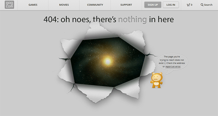
GOG displays a unique design to say that you lost your way. The 404 error page retains the navigation and footer menu so it is easy for users to navigate. Users can also report the error.
404-error-page_GOG_screenshot

UX Booth

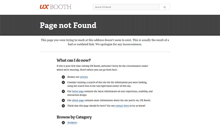
The UX Booth 404 error page uses simple, concise and direct language and an immediate apology. The page suggests popular links on the website as well as the list of categories. It also retains the footer links and the search bar.
404-error-page_UX-Booth_screenshot

Average Joes Blog

Average Joes Blog is a good example of category-rich 404 error page. In fact, the 404 error page is a replica of the home page.

404-error-page_Average-Joes-Blog_screenshot

Philips

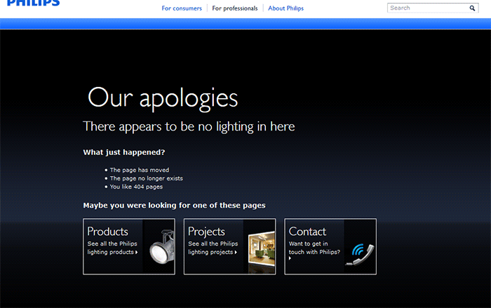
Philips goes creative and witty with its 404 error page. It mentions the absence of lighting then explains what happened and suggests popular links.
404-error-page_Philips_screenshot

Email Center UK

The Email Center UK website uses humor. Since you are at an error page, it means someone messed up and you get to choose who to fire for the fiasco. Below all that is a simple link to the home page.

404-error-page_Email-Center-UK_screenshot

Hootsuite

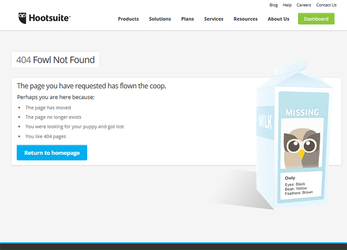
The Hootsuite 404 error page lists down possible reasons for the error. They used ‘fowl” language to keep the identity of the brand/mascot.
404-error-page_Hootsuite_screenshot

IMDB

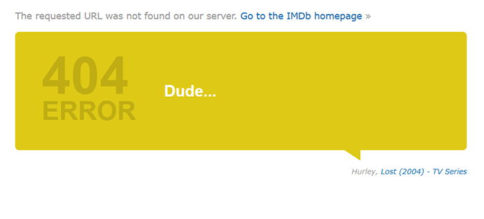
The IMDB 404 error page uses a simple layout with a clever idea. Every visit to a 404 error displays a random movie quote. Movie buffs will definitely find this entertaining. A convenient link to the home page is also positioned at the top.
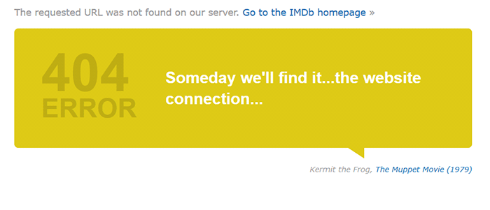
404-error-page_IMDB_screenshot

404-error-page_IMDB2_screenshot

Blue Fountain Media

Blue Fountain Media makes a 404 page that you will look forward to – an actual PAC-MAN game. They retained their main navigation and a “Go Back” link that takes you to the last visited working page.
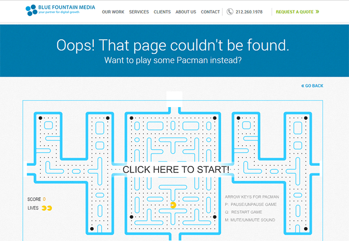
404-error-page_Blue-Fountain-Media_screenshot

Not Found Org

NotFound.org actually uses its 404 error page to achieve a goal. It is an app that you can install in your website. It lets you customize your 404 page to help their cause – find thousands of children that go missing every year.
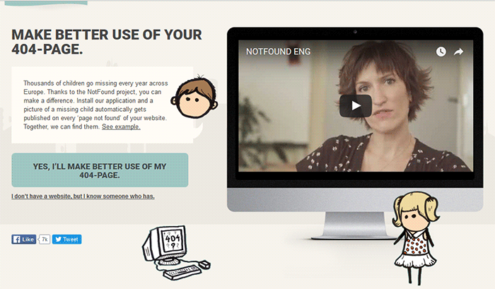
404-error-page_Not-Found-Org_screenshot

Creating a Custom 404 Error Page

Now that you have some inspiration, it’s time to create your own. You can check out WordPress’ basic guide here if you are able to code, if not you can check out the plugins below.

Since WooCommerce is installed on the WordPress platform, you can use the power of WordPress plugins to create awesome About Us pages.

Custom 404 Pro

The Custom 404 Pro plugin lets you override the default 404 page with any page of your choice. To set your custom 404 error page:

  1. Install and activate the Custom 404 Pro plugin.
  2. Create a new page that you want to use as your 404 error page.
  3. Click on Custom 404 Pro on your WordPress Dashboard and then click on Settings.
  4. Set the page or URL that you want to use as your 404 error page and then click on Save Changes.
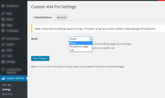
Create-custom-404-error-page_Plugin_Custom-404-Pro-Settings

404page

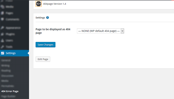
404page is another easy plugin to use to create custom 404 error pages. To create a custom 404 error page using the 404page plugin:

  1. Install and activate the plugin.
  2. Create a new page that you want to use as your 404 page.
  3. Click on Settings and then choose the page that you want to use as your 404 error page.
  4. Click on Save Changes.

Plugin_404page_Create-custom-404-error-page

Test Your 404 Error Page

To test if your new 404 error page is working, just pop any non-existent URL in your domain on your browser. If your new 404 error page does not appear, check if your website is set to redirect to your new 404 error page.

Create-custom-404-error-page_Plugin_404page

Conclusion

404 Error Pages can be annoying but you can use them to your advantage. Customize them to boost engagement and conversion. Align your new 404 error page with your brand image and website goals. It will do wonders for your WooCommerce store and your brand. Do you have any other suggestions for creating a good 404 error page?


Filed Under: Code Snippets, How-To Articles Tagged With: best practices, design tweaks, navigation, plugins, redirection, WordPress

How to Build an Ecommerce Roadmap in Under 3 Hours for a ROI of $1000’s

February 16, 2016 By John 1 Comment

Ecommerce-Roadmap-in-Under-3-Hours-for-a-ROI-of-$1000’s

Objective of the Blueprint

My goal for this post is to educate retailers, on exactly what they need to have as the foundation of their website, to build a strong digital strategy on successful online store on top of.

This is an action document. Every philosophy is followed by a list of action steps.

There is nothing new here, we have merely taken the best advice from top web design firms and condensed it into an actionable post. If you were to spend 20k plus at a prestigious web agency these are the sort of questions they would address in the pre-contract and kick-off phase of the project.

Invest Just 3 Hours for a ROI of $1000’s

time-invest-roiI recognize the opportunity cost of your time and I wholeheartedly believe in delegating as much as possible. But this 3 hours is not one of those times, the reality is it will take someone else much longer than you to do this because the information is already in your head. If you can allocate just a few hours of your time you will end up with a website brief worth 1000’s of dollars.

You will be able to take this brief to a number of web agencies and be a highly sought after client. The biggest challenge web agencies have is a client not providing them with the information they need to do their job. If you present this finished document to them they will love you and you will likely get a much better rate.

Some of these questions may feel repetitive or as though you have answered them 100 times before. Trust this process in the knowledge that all high end web design firms insist on this type of documentation, known as the “Discovery Phase”, and build $2000 plus into the project price to extract this information out of their clients.

If you have a business or marketing plan and some of these questions may have already been addressed, by all means use that as a reference. The critical thing is that you have all the information in your “Website Blueprint”.

Your Business Objectives

Whats-Your-StoryThe very start of the website blueprint is to identify why you have or want a website in the first place. Your website should be the core of your marketing, not a separate entity. As such, your website objectives need to be the core of your business objectives.

I’m going to throw you in the deep end and run a list of questions that in time you should be able to answer. Don’t worry, these questions are not designed to be answered right now. They are just meant to get your thinking going.

  • What specific reasons do you have for owning a website?
  • Are you not really sure, but see everyone else has one and don’t want to miss out?
  • What would life look like if you didn’t have a website?
  • What % of income is generated from the site?
  • What % of leads is generated from the site?
  • If improvements were made to your website what increase in these percentages could you expect?
  • What does a successful website look like to you?

Now list the top three business objectives of your website. Here are some examples.

  • Be found on Google.
  • Sell Products.
  • Actively generate leads.
  • Pre-qualify clients.
  • Show we are an authority in our particular niche/segment.
  • Resource to describe the services you offer.

Branding

BrandingYou probably already have some sort of visual branding such as a logo with a color scheme and brand or trading name. It will be a wise investment to spend 30 minutes looking at these and assessing if they still fit the business objectives you are trying to achieve.


Grab some of your marketing assets, e.g. print brochure, letter head, business cards, existing website, and have these in front of you while you go through the rest of this section.

Who are you? What do you do? Who do you do it for?

When a customer visits your website for the first time, you have only a few seconds to answer these questions. The words you use are only one way to address this, There are a lot more subtle cues such as the color, images and font type you use.

  • Who are you?
  • What do you do?
  • Who do you do it for?

Before answering the above questions I want to take you through an exercise.

Answering these questions below first will assist in uncovering the personality of your brand. They may feel a bit weird, but try and see it through.

  • If your website was a car, what make and model would it be?
  • If your website was a cookie, what sort of cookie would it be?
  • 10 – 20 Words that describe the business.

On a scale of 1-5, 5 being my business is most like this word, rank the following words.

Thats-my-Business

  • Feminine
  • Masculine
  • Young
  • Mature
  • Luxury
  • Economical
  • Modern
  • Classic
  • Playful
  • Serious
  • Loud
  • Quiet
  • Simple
  • Complex
  • Subtle
  • Obvious

Target Audience for the Website

If you could have 10 new customers today, but they all had to be a clone of one of your existing customers, who would the existing customer be?

The best way to find that existing client is to identify who is the most profitable, gives you the least amount of grief, is a joy to work with, refers you to new business, pays on time and who you would genuinely like to have more of.

Describe your ideal client. *Some things to consider.

  • Your-Ideal-CustomerInvolved in what industry/business
  • Title
  • Income bracket
  • Education level
  • Lifestyle
  • Social circle
  • Recreation activities
  • Type of car they drive

Now you can answer:

  • Who are you?
  • What do you do?
  • Who do you do it for?

Positioning

The main thing about positioning is you have to take a position. If you try and be all things to all people you will be nothing to everyone. Here are some different ways to position yourself.

  • Industry Segment.
  • Geographic. Position yourself as the local expert.
  • Price. Expensive or budget.
  • Process. Demonstrate your process is better and more organised.
  • Customer service.

The previous exercises will help. Now you know who you are and who you want to serve, it’s now time to present yourself exactly as you want to be seen.

  • What is your niche, specialty, or position in the market?
  • What makes you different from your competitors?
  • What are your strengths that can give you a competitive edge?
  • What is your Unique Selling Proposition (USP)?

Now you are ready to create a positioning statement. Fill in the blanks below:

A [Your Company] client is someone who wants […………………………….] and recognizes our specialized focus in […………………………].

Content Audit

You now need to do an audit of what assets you have that will affirm your position in the market. These include:

businessman-write-laptop

  • Images
  • Videos
  • Articles
  • Interviews
  • Tutorials
  • Whitepapers
  • Case Studies
  • Portfolios
  • Testimonials

If they are already on your existing website, that’s great. The questions then are. “What is there?” and “Are they being used as effectively as possible?”

Eventually every piece of content on your site will need to be reviewed and updated as necessary. But for the moment, just taking stock will do. At a glance you will be able to:

  • See what assets you have
  • Rate their quality
  • Rate their relevance to your position in the Market.
  • See what areas you will need to increase your investment

Call to Action

Now you have identified what assets you have and what you need. Go back to your list of three business objectives for your website and spend a minute to review them and see if they are still relevant now that you have refined your position in the market.

Now with these objectives in mind what are the top three actions you want users to take when they visit your site?customer_shopping-cart

Here are some ideas:

  • Buy a product
  • Phone you
  • Browse your services
  • Fill out the contact/quote request form
  • Look at your portfolio
  • Give you their email address
  • Like your Facebook page

These top three actions need to be the most prevalent items on the main pages of your site visitors are coming to. You can find out which pages on your site visitors are landing on from Google Analytics.

Fulfilling Website User Needs

Users come to your site with specific tasks in mind. You need to identify what these are and then present them with choices that fulfill their needs at the same time as meeting your own business objectives.

  • Why would people visit your website?
  • What tasks do they want to complete when they are at your website?

There are a number of core functionalities most web users expect when they go to a web site, these are:

  • Contact
  • Services/Products Offered
  • About Us
  • FAQ

Contact Page

contact-us_small-iconsYour contact page is the page your customer sees after they have made a significant mental shift in their decision making process. The moment they click on the contact page they become more invested in you and your brand.

The way you approach this will depend on the personality of your brand and the services you offer. Here are a few options.

Serious. Just the facts.

Let people know where they are on the page with a “Contact Us” heading. Followed by; address, phone number, email, and trading/office hours (if applicable).

A map, either an embedded map or just a link to your address on Google maps.

Simple Contact Form including fields for:

  • Name
  • Email
  • Phone
  • Postal Address
  • Inquiries

Prompt the User to Think About Their Purchase.

If the product/service you sell is more involved and has multiple options and additional purchasing criteria, you can encourage your visitors to invest time and energy into getting somewhat emotionally involved about their potential purchase with you. You can add fields like:

  • Type of Project
  • Budget – If you can’t profitably serve projects under a certain amount you can use this as a filtering process by having a drop down and not offering budgets under $X
  • Timeline

If the project requirements are more detailed than a few fields it will be worth considering a separate page titled “quotation request” or “project planner”.

Add Some Personality to the Contact Page.

Add a big background image. This could be a recent project, a photo of the team, or an aerial view of your office.

  • Some fun or cheeky text, e.g. For a good time call …………………
  • Encourage the client to contact you through social media channels.

Products/Services Offered

Your category page, or pages, acts as a quick link for users to see the details of what you do and just as importantly don’t do.

It is important that the home page, portfolio and about page only give snap shots of what you do, so that the user does not get overwhelmed with details, and instead can get a feel of your positioning in under the 3 seconds you have their attention for.

The category page is your opportunity to go into the detail that you have intentionally held back on the home page, portfolio and about pages. Visitors clicking deeper into your site that get to your category and products pages have requested this information, so will spend slightly more time looking at it.

Photographer-Camera_SLRThey still won’t spend as much time as you think, or want, so use of sub-headings and thumbnail images is critical. 90% of people won’t read the body copy. It needs to capture the viewers’ attention in a matter of seconds. This is achieved by allowing the photos to tell the story.

Don’t take the photos on your phone. You at least need a good quality camera and preferably someone that knows what they are doing with it. If you don’t have someone with these skills you should hire a professional photographer.

Is there anyone on the team with a good quality camera that has some training in photography?

FAQ

What are the 5-10 most common questions you get asked? Wouldn’t it be nice not to have to answer these as often? Wouldn’t it be nice for your clients not to have to ask? And what about the ones that are too shy to ask? Could you be missing out on a lead?

It’s a simple and easy process and most web users interested in you will appreciate it.

About Us Page

About-Us_BusinessmanUse this opportunity to go deeper into establishing your position in the market. Review the answers to your questions from the positioning exercise and back this position up here.
This page should be kept reasonably brief and it’s a good opportunity to link to other areas of your site like:

  • Products/Services
  • Case Studies
  • Team member profiles
  • Blog
  • Whitepapers
  • Testimonials

Viewable on All Devices

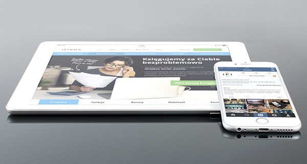
mobile-devices-tablet-androidIt is estimated that over half of website visitors will be viewing your site first from a mobile device. If your website is not “responsive” to all screen sizes you could be losing important leads before you even begin.

Responsive design is the practice that allows a website’s pages to reformat themselves depending on which device they are being displayed on. This ensures that whatever screen size the user is viewing your website on it will remain user-friendly.

There is no excuse now for small business sites not to be responsive.

Sales Funnel and Lead Capture

People buy from other people they know, like and trust. The object of lead capture is to get your leads into your know-like-trust funnel, and the best way to do that is by giving them incredibly valuable information over time via email. Yes, boring old email.

The Hero’s Journey

Time-for-change_DoorLuke Skywalker was living a simple life as a farmer on the planet Tatooine. He knew there was more opportunity out there in the universe and through a series of events he was called by a message from the princess. At first he resisted, but then his mentor Obi-Wan Kenobi showed up and guided him.

This story structure has been used over and over again. The Matrix is another good example, with Neo and his mentor Morpheus. You can use this story structure to develop your buyer’s journey.

Most of you reading this will have something to sell online in firms with less than a 10-person staff. You have some knowledge of digital marketing and can’t deny you need a strong web presence. There are a number of things you think might benefit your business like:

  • Increase in online sales
  • Blogging
  • Weekly Newsletters
  • Social Media

And generally engaging at a deeper level with your customers via an online strategy.

But how to execute all these moving parts into a cohesive system that does not take all your time or cost the earth is a bit of a quandary. You are resistant to throwing 20-30k to what you don’t understand well enough to monitor, control and be guaranteed a return on your investment.

How am I doing so far?

Wooassist offers a service that is affordable and may solve a lot of your challenges. Instead of selling you our core offer straight away we present this article that guides you through the fundamentals of an online store.

There is nothing here that sounds too farfetched; just some common sense, down to earth advice. And by the time you finish reading this article, you will be much more confident and prepared to outsource some assistance for your online store.

Now Your Buyers Journey

Where Are They Now?

Going back to your ideal client. Where are they now? What problems and challenges are they trying to solve?

Start with the End in Mind.

What do you want them to ultimately do? What do you want to ultimately sell them? Is it a commodity product, a project with X budget or an ongoing maintenance contract?

Bridge the Gap.

It’s your job to guide them from where they are now to where they can be knowledgeable enough in your process and confident enough in your expertise to pay for your service.

Identify the time line from interest to purchase for the niche you are in and then list the information your client needs over this time period to get them to know, like and trust you.

This doesn’t have to be complicated; a simple 2000 word report to get their email address followed up by 5-10 pre-written automated emails could increase your sales by 50%.

You can get into more of these details later. For the moment, all I want you to do is a quick brain storm and come up with 3 potential topics for an eBook or whitepaper.

Ongoing Correspondence

Email-Ongoing-CorrespondenceThe 5-10 pre-written automated emails are called email auto responders. They are not “Buy Now”. Like dating, we are asked in for “coffee” at some stage, but usually not the first date. And it’s always better to be asked than to ask.

The email auto responders add to the value of the report. They prompt your subscriber to think about working with your firm without blatantly stating it.

After 5-10 emails it might be appropriate to offer a gateway product. It’s much easier for a customer to give you $1000 if they have already given you $100 and feel like they got value out of it. And it’s much easier for them to sign a 10k contract if they have gotten value out of $1000.

A gateway product could be a preliminary design, a consultation or an educational product like a series of video tutorials.

What gateway product/s could you offer?

Search Engine Optimization (SEO)

SEO-Search.Engine.OptimizationGoogle’s business model is to return the most relevant search results so people keep using them to search online. Google is very good at correctly assessing the most relevant websites and have hundreds of criteria to determine their rankings.

There is no longer a magic bullet. The answer is to have a well-rounded website built on a best practice code base that offers the content your users are searching for in an interesting and engaging way.

 Search Terms

What terms are your ideal client using when searching for your products or service?

They may not be the same terms that you use.

Make a list of the 5-10 phrases that you think your ideal client will be searching and then play around with creating synonyms, abbreviations, plurals, past tense, present tense, verbs nouns, etc. From one word “Shoe” we can get: shoes, footwear, runners, joggers, walkers and probably many more.

You will not rank for shoe, so it’s keyword “phrases” that we are looking for that will attract your ideal client. E.g. Comfortable walking shoes. The words need to be compared to other variants like comfy trekking footwear.

For the moment we are just looking to brainstorm, down the track you can compare these terms and phrases in Google Trends and the Adwords keyword tool.

To go the extra mile you can do a short-term Adwords campaign for a few hundred dollars testing all these key phrases. The data you get from the Adwords campaign will tell you what are the most commonly searched terms and what terms generate the most engagement on your site. You can measure this by bounce rate, pages visited and time on site.

Help Google Find You

Magnifying-GlassYou can assist Google by basically labelling your content. Everything on your site can be labelled by what’s called meta data. Meta data is not visible to the user, but helps Google web crawlers identify what your site is about. All good website platforms like WordPress have this baked in to make it very easy to add “meta data” to any page, image or link on your site.
On its own, meta data won’t do much to get you in the rankings. It needs to be accompanied with relevant content that backs up what the meta data is saying your site is about. Your content needs to have your keywords in it, plus synonyms and related words. If you are genuinely writing about the topic you want to rank for then this should happen naturally.

Let Google Know you are Relevant and an Authority

Having links to your site from other relevant websites is still the number one way to rank highly in Google. It’s just a lot harder now to game the search results. A few years ago it was possible to create these links yourself and trick Google into thinking you were popular, but Google has made it its mission to recognize “un-natural” links and have been very successful in this. The best way moving forward is to create content so good and useful that people will link to it from their site and will share it with their friends on social media.

For more detailed information check these links.

http://moz.com/beginners-guide-to-seo

http://static.googleusercontent.com/media/www.google.com/en//webmasters/docs/search-engine-optimization-starter-guide.pdf

Noticed I linked to them because they are highly valuable and useful.

The irony is you will rank high in Google when you no longer need to. If you create the great content that Google wants you to, and people are sharing your content, then you will be getting a lot of traffic to your site without the help of Google.

Local Geographic Focus

A lot of companies operate within a geographic boundary. Google Places is a great free service that you can sign up for and will increase your chances of ranking on the first page in the Google Maps section, which is right up the top of the search results.

http://www.google.com/business/

You can also increase your chances of getting ranked in Google places for specific searches for your local area by writing articles that relate your service to the needs and uniqueness of your local area.

Social Media

Social media pages can become gateways to obtaining new clients and maintaining good relationships with your existing clients.

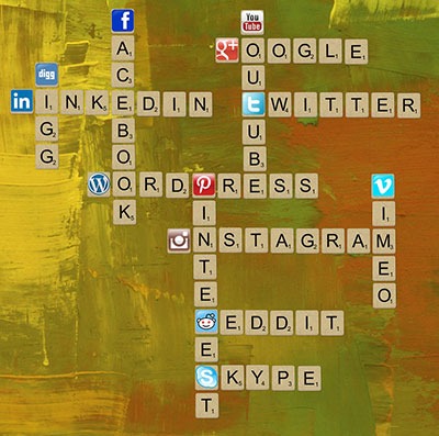
Scrabble_Social-MediaThe most important social networks to consider are:

  • Facebook
  • Twitter
  • LinkedIn
  • Google+

If your business relies heavily on visual media, then the following might also be considered:

  • Instagram
  • Youtube
  • Pinterest

How to Start

Once you have signed up for and created your social media profiles and pages, you can start getting followers or subscribers.

First off, try getting your own social media friends and connections, as well as your existing clients to like and follow your pages.

The next step is to create content that your targeted social media users will be interested in. These could be interesting photos, stories, articles and even recent info in your industry.

If you have created useful and interesting content, your followers will start sharing them with their own networks and this creates a chain reaction of sharing and get more people to see your content. If these people are interested in what your business offers, they will like your page and increase your social media presence.

It is also a good idea to provide links to your social media profiles directly on your website and email signatures.

Building Brand Awareness

Your social media profiles and pages give users an alternative glimpse from your website of what your company is all about. Give your profiles and pages an identity and real human voice that your ideal clients can relate to and who they would want to work with.

With that said, however, do not simply talk tirelessly about yourself. People use social media for connecting with others. They do not want to be simply marketed to.

Building Relationships

Web-tablet-social-mediaThe main purpose of creating a social media presence is to build and nurture relationships with your existing and previous customer base. Your social media profiles and pages can serve as a means for people to contact you and you can and should promptly reply to these inquiries as well.

If you keep your business at the forefront of your customers’ attention in social media, you will be the one they contact when they need to acquire your products and/or services once again.

Best Practices

  • Post content that is relevant to your industry like recent industry news.
  • Post content that interesting or informative to your audience like tips and tricks to home renovation.
  • Follow similar social media pages in your industry.
  • Be a part of the community. Interact, share others’ posts and respond to others’ interactions.
  • Make use of a human voice. Avoid sounding too corporate or salesy.
  • Observe social media etiquette. Your social media identity defines your brand identity.
  • Depending on your audience, post 1-4 short updates daily or 1-2 important announcements every week.

Social Media Tools

To save your time, there are multiple tools, free and paid, that can help automate your social media campaigns.

  • Hootsuite (https://hootsuite.com/)
  • Buffer (https://bufferapp.com/)

Conclusion

Start-Up_PlanningIf this is the first time you have read this, congratulations. Now go through it again and invest just three hours to build a really solid foundation for what is to become your website strategy.


If you have answered the questions, even with your best guesses, then congratulations. You have just developed a really solid platform for building a website strategy and put yourself miles ahead of your competition.

What to do now?

Collate your answers from this blueprint into an “Online Blueprint Document.” The time it takes you will pay dividends many times over.

Regardless of what you sell online there are 101 tasks you can outsource. Whether you choose a full service agency, do it yourself, or something in between like what wooassist.com offers, communication is the key and this doc will get your vision clearly stated and set the foundation for any web developer/designer relationship you have in the future.

Filed Under: How-To Articles Tagged With: best practices, conversion optimization, customer persona, LinkedIn, marketing strategy, social media, Twitter, Wooassist, WordPress, WordPress SEO

How to Center Logo in Storefront Theme

February 12, 2016 By John 35 Comments

Centering the logo on a WordPress site is a popular design concept, but doing it can be tricky. Most themes, Storefront included, are styled with the logo aligned to the left.

While you can use a premium plugin like Storefront Designer to center the logo, you can edit your child theme’s CSS instead. There are two benefits in doing this manually. For one, you don’t have to buy a plugin. Secondly, you don’t add extra bloat to your site.

How to Center Logo in Storefront with CSS

Centering Your Logo with CSS

Before anything else, you should install a child theme on your site otherwise the changes you make will be lost every time you update your theme. Alternatively, you can use Simple Custom CSS Plugin which creates a new stylesheet that won’t get overwritten.

Add the following code to your child theme’s styles.css:

@media screen and (min-width: 768px) {
	.site-branding{
		text-align: center;
		margin: 0 auto !important;
		float: none !important;
	}
}

Text align and margin set the margin to adjust accordingly to the sides. We need to place “!important” in that line to make sure that it gets priority and doesn’t get overridden by other CSS codes.

We also need to override the default “float:left;” code so that it won’t stick to the left. We do this using “float:none !important;”.

To make sure these styles don’t affect the mobile version of your site, we set a minimum width in the selector.

Doing Away with the Secondary Menu and Search Bar

If you are using Storefront out of the box, the secondary menu and the product search bar will still be in the way. We need to do something about that next. Temporarily, the header will look something like this.

Doing Away with the Secondary Menu and Search Bar

To remove the secondary menu, go to Appearance > Customize > Menu > Menu Locations and do not set the secondary menu to anything.

To move the search bar inline with the main navigation and cart menu, you have to paste the code below to your functions.php file. A word of warning, do not proceed with this step if you do not know what you are doing. One slip up here could cause your site to go down and become inaccessible. Alternatively, you can install My Custom Functions plugin to insert the code. The plugin warns the user the code will cause a fatal error.

add_action( 'init', 'jk_remove_storefront_header_search' );
function jk_remove_storefront_header_search() {
remove_action( 'storefront_header', 'storefront_product_search', 	40 );
add_action( 'storefront_header', 'storefront_product_search', 	70 );
}

After this step, your site will look something like this.

Move search bar inline with the main navigation and cart menu

The product search bar is still not inline with the main navigation as you can see. The CSS code below will adjust the width of the main navigation so that the search box won’t warp around to the bottom.

/*adjusting the width of the main-navigation*/
.woocommerce-active .site-header .main-navigation {
	width: 50%;
}

Applying the CSS code above will result to this. Now, the only thing left to do is to resize the search box using CSS.

Adjust width of main navigation for search box to un-warp around the bottom

Putting Everything Together

Put everything inside the media screen brackets, together with the CSS code for the resizing of the search box. The final CSS code will be:

@media screen and (min-width: 768px) {
	/*centers the logo*/
	.site-branding{
		text-align: center;
		margin: 0 auto !important;
		float: none !important;
	}
	/* adjusts the width of the main navigation container to accommodate the search box in the same line*/
	.woocommerce-active .site-header .main-navigation {
		width: 50%;
	}
	/* positions the search icon properly in the search box*/
	#masthead .site-search .widget_product_search form:before {
		top: 1.75em;
		left: .75em;
		position: relative;
	}
	/*  resizes the search box*/
	#masthead .site-search .widget_product_search input[type=search],#masthead .site-search .widget_product_search input[type=text] {
		padding: .5em .5em .5em 2em;
		line-height: 1;
	}
	/* places the search box to the left of the cart menu(optional)*/
	.woocommerce-active .site-header .site-search {
		float: left;
	}

}

And you’re done. The outcome should look something like this.

Storefront Center Logo_Final

If you are unable to achieve this with the above code snippets, it could be that you are using a child theme that has codes that conflict with the codes above. Feel free to post your questions in the comments section.

Filed Under: Code Snippets, How-To Articles Tagged With: code snippet, CSS, design tweaks, how-to, mobile friendly, Storefront, WooCommerce, WordPress

How to Make a Sticky Header in Storefront Theme

February 5, 2016 By John 65 Comments

REVISED 03/04/2020 : Updated stickyheader.js path file

One popular trend in web design today is making the logo and the navigation bar to stick to the top. There are many names for this type of layout. Sticky, floating or persistent headers, and floating navigation are all the same thing.

Developers can “stick” their navigation at the top using simple CSS code. This helps visitors to click on other pages from the navigation menu while scrolling. Here’s how:

Preparation

Before anything else, you should install a child theme on your site. Additionally, you can install customization plugins such as My Custom Functions and Simple Custom CSS. We recommend using these plugins if you are not comfortable working with code as errors can break your site.

sticky-header-1
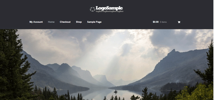
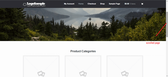
The test site looks like this at the start of this tutorial. In this case, the logo is centered. If you want to learn how to center the logo in Storefront theme, you can check out this post. The search bar and secondary menu was also removed.

Adding the CSS

To make this header layout stick to the top, just paste the CSS code below at the bottom of your style.css file.

#masthead {
		position: fixed;
		top: 0;
		width: 100%;
}

One obvious design pitfall here is that the large default header of Storefront is too big. It gets in the way of the page contents and is too distracting. To solve that, we need to make our header layout smaller first.

We aim to end up with this layout.

sticky-header-2

To achieve this, we need to do some CSS positioning. The positioning values of the elements depend on the size of your elements. If you have a different sized logo, play around with the height value in the CSS code to move it around. Here is a good article to get familiar with CSS positioning techniques. The code below will position and resize the header elements. It also applies the “position: fixed; top:0;” to the masthead. Paste this to your style.css file.

@media screen and (min-width: 768px) {
  	/*resizing the logo image */
	#masthead .custom-logo-link img {
		width: auto;
		height: 40px;
	}
  
	/*positioning the main-navigation */
	#masthead .main-navigation {
		text-align: right;
		position: fixed;
		top: 0;
		right: 300px;
		padding: 0;
		width: auto;
	}
  	
	
	/*positioning the logo*/
	#masthead .custom-logo-link {
		position: fixed;
		top: 0;
		margin: 0;
		padding: 0;
	}
    /*adjusting default margins and paddings*/
    #masthead .site-header-cart .cart-contents{
        padding:1em 0;
    }
    #masthead .main-navigation ul.menu>li>a, .main-navigation ul.nav-menu>li>a {
        padding: 1em 1em;
    }
    #masthead .site-branding{
        margin-bottom: 1em;
    }
	
	/*positioning the cart-menu */
	#masthead .site-header-cart {
		width: 14% !important;
		position: fixed !important;
		top: 0;
		right: 12%;
		padding: 0;
	}
	
	/*applying the position fixed on the masterhead */
	#masthead{
		position: fixed;
		top: 0;
		width: 100%;
	}
    /*removing the site search*/
    #masthead .site-search{
        display:none;
    }

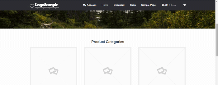
Note that as the page scrolls down, the header stays on top. We have achieved the basic sticky header layout that is not intrusive to the content. It is concise and doesn’t get in the way of the rest of the page.

If you are happy with this, it’s okay to stop here. If you want to take it up to another level, a very common variation of the sticky header is the shrinking header. The shrinking header allows a default full header view when you are at the top of the page. When you start scrolling, the header automatically resizes itself to get out of the way. If you want more coding challenge, read on.

The Shrinking Header

First is to create a js file in your theme’s /assets/js/ folder.

Copy and paste the code below and save it as “stickyheader.js” to the js folder of your theme.

(function($){
	$(document).ready(function () {
		$(window).scroll(function() {
			  if ($(this).scrollTop() > 100){  
				jQuery('#masthead').addClass('sticky');
			  }
			  else{
				jQuery('#masthead').removeClass("sticky");
			  }
        		});
	});	
})(jQuery);

The code basically says it will add the “sticky” class to the header when you’ve scrolled 100px from the top. Else, it will remove it.

Adding the jQuery file to WordPress

Next step is to tell WordPress to include the JS file you just created. Copy and paste the code below to the My Custom Function plugin.

$path = get_stylesheet_directory_uri() .'/assets/js/';
if (!is_admin()) wp_enqueue_script('stickyheader', $path.'stickyheader.js', array('jquery'));

jquery My Customs Function plugin

After this, your JS file will load together with the other js files within your theme. Every time you scroll down, your script will now add the class “sticky” to your header. At this stage, you will not see anything happen yet. This is because we haven’t styled our sticky class yet.

The CSS Code

To style the sticky class, copy this code to your style.css file. Same as before, this is just CSS positioning and resizing. The only difference this time is we attached the “sticky” class on the selectors.

@media screen and (min-width: 768px) {
  	/*resizing the logo image */
	#masthead.sticky .custom-logo-link img {
		width: auto;
		height: 40px;
	}
  
	/*positioning the main-navigation */
	#masthead.sticky .main-navigation {
		text-align: right;
		position: fixed;
		top: 0;
		right: 300px;
		padding: 0;
		width: auto;
	}
  	
	
	/*positioning the logo*/
	#masthead.sticky .custom-logo-link {
		position: fixed;
		top: 0;
		margin: 0;
		padding: 0;
	}
    /*adjusting default margins and paddings*/
    #masthead.sticky .site-header-cart .cart-contents{
        padding:1em 0;
    }
    #masthead.sticky .main-navigation ul.menu>li>a, .main-navigation ul.nav-menu>li>a {
        padding: 1em 1em;
    }
    #masthead.sticky .site-branding{
        margin-bottom: 1em;
    }
	
	/*positioning the cart-menu */
	#masthead.sticky .site-header-cart {
		width: 14% !important;
		position: fixed !important;
		top: 0;
		right: 12%;
		padding: 0;
	}
	
	/*applying the position fixed on the masterhead */
	#masthead.sticky{
		position: fixed;
		top: 0;
		width: 100%;
	}
    /*removing the site search*/
    #masthead.sticky .site-search{
        display:none;
    }
	
} 

The jQuery script above inserts the sticky class to the master head. We just need to implement the CSS positioning as we did before using the sticky class selector.

For example, our selectors will now be “#masthead.sticky”. We just insert “.sticky” to our selectors so it will only be implemented when we scroll down.

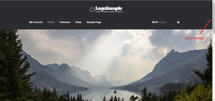
When everything is done, we will be able to see the full header on top of our page.

sticky-header-3

When scrolling down, the compact header replaces the full sticky header.

sticky-header-4

We hope you found this tutorial helpful. If you have any questions or if this didn’t work for you, drop a comment in the comments section and we’ll see what we can do.

Filed Under: Code Snippets, How-To Articles Tagged With: code snippet, design tweaks, navigation, responsive design, Storefront

How to Create Calls-to-Action that Convert Online Sales

January 28, 2016 By John Leave a Comment

calls-to-action

Successfully selling online requires more than just posting your products on a WooCommerce site and hoping for the best. You also must increase your e-commerce site’s traffic with visitors that match your target market. This takes a considerable investment of time and money, so before that investment you need to make sure you are set up to convert all those visitors into customers. In this post, we will teach you how to create calls-to-action that convert for your WooCommerce store.

What is a Call-to-Action?

For e-commerce sites, a call-to-action (CTA) is a message that moves visitors toward your desired response. It can be a hyper-linked text or phrase, a button, a banner or any clickable element. Calls-to-action are usually seen in lead generation, sales funnels, trials and downloads. Its purpose is to help you achieve a goal or a conversion for your e-commerce store.

Why are Calls-to-Action Important for E-Commerce Stores?

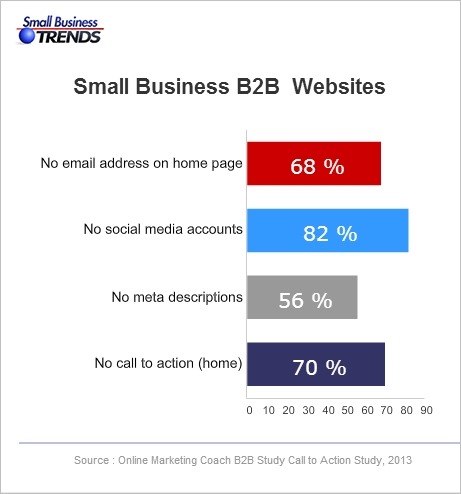
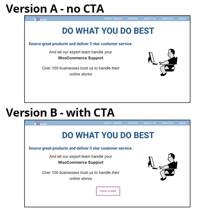
Ever wonder why some e-commerce sites make it big online while some do not? A survey on website failings showed that 70% of websites that fail do not have a CTA on their home page. Good website design and high traffic is not enough to get higher conversion rates. CTAs tell your visitors or audience what actions they can take.

B2B-call-to-action
Source: http://smallbiztrends.com/2013/08/b2b-small-business-websites-lack-call-to-action.html

There are nearly a billion active websites today. People could easily switch to another website if you don’t get them to take action. Your CTA is your marketing tool to educate, engage, and capture your potential customers. It will help you increase your conversion rate as you guide visitors to complete your e-commerce goals.

cta-samples-wooassist-view-plan

How to Create Calls-to-Action that Convert for Online Sales?

Having a CTA is not as simple as putting a text over a button. A weak or an unclear call-to-action may impede the sales process and you could end up losing a client. 30,000 new consumer products are being launched every year. Unfortunately, Clayton Christensen of Harvard Business School found that 95% of them fail.

Businesses often fail because they don’t take the time to understand their customers. Try to understand reasons behind sales and use that knowledge to your advantage. It will not only increase your online sales but promote customer loyalty.

There are four things you need to know to be able to create calls-to-action that convert online sales for your e-commerce store.

The Copy

You are often limited to just a few words or a phrase but that does not mean you should take this lightly. A subtle word change can make a big difference. Here are a few tips that you should consider.

Determine your Outcome

What outcome and action do you want from your audience? Is it accessing your shop page, signing up on your email list, downloading a trial version of the software, or downloading your e-book? Being clear with your desired outcome will allow you to get the results you want. CTAs should use specific, understandable and concrete language to lead customers to your goal. Avoid using ‘cute’ and vague language. To be effective, a customer must know what’s going to happen when they click on your CTA.

cta Change your life
Example of a vague CTA
cta Interested
Example of cute language. This CTA may seem attractive to some but it does not get as much clicks as ‘Download E-book’.

Identify your Audience

A CTA that works wonders for another website may not work the same way for you. A generic or copied call-to-action will work but conversions sky-rocket more with optimized versions. You can use analytics data to help you decide. Know your audience. Create a customer persona. By understanding your audiences’ desires and needs, you can convert them to paying customers better.

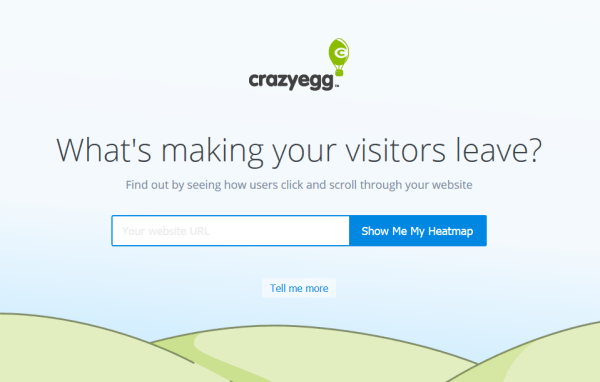
cta sample crazyegg
Crazy Egg asks its potential customers to try out their service for free.

Tailor to your Platform

Different platforms offer different methods of interaction so modify your call-to-action to the common responses for each medium. Requesting a comment or reaction is appropriate on a blog or social media post but not on a landing page.

cta sample share
This is the kind of CTA that you’ll use in a blog post.

Position is Key

Calls-to-action should be placed after informing your visitors of what they are getting at. It can either be above the fold or below. You can also consider following the F pattern. You can add it at the end of a video or set up your website to display them before your visitor exits.

cta ab test sample
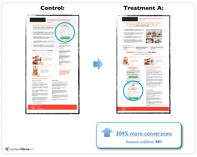
People need information so the change in location benefited this landing page.
Source: http://contentverve.com/10-call-to-action-case-studies-examples-from-button-tests/

Design is Important

Design should make your CTA noticeable but it should not interfere with your design. Don’t be too pushy with getting a sale as this might actually harm your online conversions. Your CTA needs to stand out from all the clutter. Try using white space to draw in more attention to it.

cta sample amazon ctas
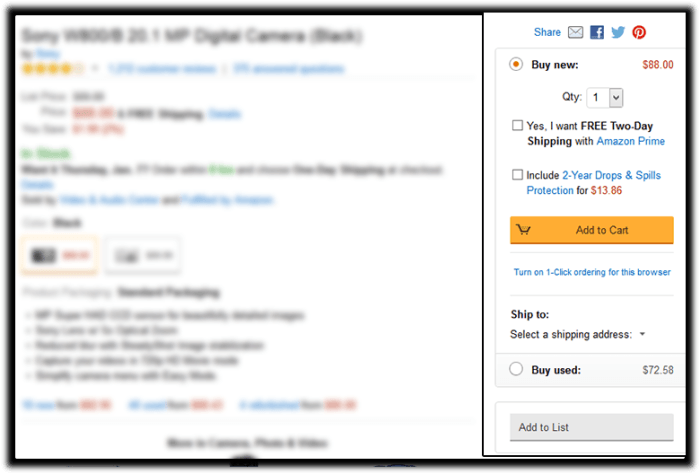
Amazon’s add-to-cart button stands out more than other CTAs in this sidebar. Its cart icon is good for visual association.

Colors help you increase your online conversion rates because colors have implied meanings. Your design needs balance. If you need a large button, choose a less prominent color that is relative to the elements around it. For smaller buttons, you may choose a brighter color. You can also make use of subtle hover animations.

cta ab test sample color
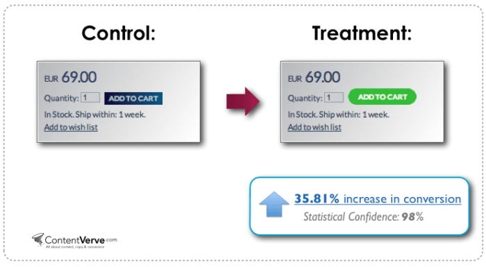
Change in color and design can increase conversion.
Source: http://contentverve.com/10-call-to-action-case-studies-examples-from-button-tests/

Optimization

Your CTA may be converting but is it the best one? Getting a high converting CTA needs constant testing. Set up your analytics and tracking services first. Use Google Analytics or Crazy Egg’s heat-maps and scroll-maps. You can also use A/B test services like Split Button for optimization. Once you have the data, do not be afraid to experiment and use the data to your advantage. You can use these A/B test ideas to get you started or check out this guide from Neil Patel on how to do split testing.

Summary

Calls-to-action help you to have higher conversion rates and good ROI for your e-commerce store. Good strategy, monitoring and optimization are keys to good CTAs. What calls-to-action ideas, experience and online marketing tips would you like to share for other online store owners? Let us know in the comments.

Filed Under: How-To Articles Tagged With: call-to-action, conversion optimization, e-commerce, how-to, marketing strategy, optimizations

  • « Previous Page
  • 1
  • …
  • 28
  • 29
  • 30
  • 31
  • 32
  • …
  • 41
  • Next Page »
Let us support your online store so you can manage your business

Get started today

Get 2 Hours of FREE SUPPORT

We are so confident that you will love our services that we will give you your first 4 hours at a 50% discount

That’s 4 hours for only $75

BUY NOW

Free eBook

5 Things Every Online Store Can Fix On Their Website In The Next Week To Increase Sales

Quick Links

  • How it Works
  • Pricing
  • Blog
  • Contact
  • About Wooassist
  • My Account
  • Checkout
  • Privacy Policy
  • Cookie Policy
  • Terms and Conditions

Wooassist

Australia:
59 Luke St.
Hemmant QLD 4174

Philippines:
San Miguel St.
Poblacion, Iligan City 9200

Connect


Copyright © 2026 · Wooassist

Yours FREE!

5 Things Every Online Store Can Fix On Their Website In The Next Week To Increase Sales