Wooassist

Assistance for Your Woocommerce Store

  • How it Works
  • Pricing
  • Services
    • Site Maintenance
    • AI SEO and Content Marketing
  • Blog
    • How-To Articles
    • Code Snippets
    • SEO For E-Commerce
    • Theme and Plugin Reviews
    • Wooassist News
    • WordPress/WooCommerce News
    • Interviews
  • About Us
  • Contact
You are here: Home / Archives for navigation

How to Increase Mobile Conversion Rates for Your WooCommerce Store

January 21, 2020 By John Leave a Comment

Over the last few years, optimizing for mobile devices has become increasingly more important. More and more users browse the internet using their phone. According to Statista, 52.2 percent of web traffic comes from mobile phones and it has only been increasing from the previous years. As a WooCommerce store owner, you must optimize your website for conversion on these smaller screen sizes. Learn how to increase mobile conversion rates for your WooCommerce store by following the tips below.

How to Increase Mobile Conversion Rates for Your WooCommerce Store

How to Optimize Your WooCommerce Store for Mobile Devices

Use a Responsive Theme
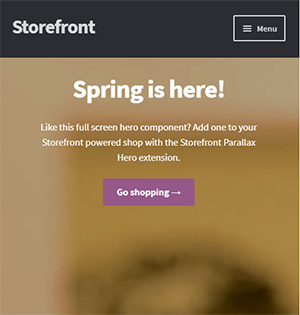
All modern themes are now built to be responsive. A responsive theme adjusts to various screen sizes. You can check with your theme developer if your theme is responsive. You can also do a quick test by going to your WooCommerce store and then try scaling down the size of your browser. If you see the elements on your website move to adjust to the smaller window, then you are using a responsive theme. If you find that your theme is not responsive, don’t worry. You can switch to a responsive theme. We can recommend Storefront and the Genesis framework.

Storefront was made by the same developers that developed WooCommerce. It is built specifically for WooCommerce so you can expect full compatibility with WooCommerce and official WooCommerce plugins.

Genesis, on the other hand, is a framework. You need to use a Genesis child theme with the Genesis framework. Genesis is well-maintained, responsive and compatible with WooCommerce. 

User Test Your Mobile Site

Open your WooCommerce store on your smartphone and do some user testing. Perform actions that you expect your customers to do on your WooCommerce store. Important elements to test are:

  • making a purchase
  • subscribing to your newsletter
  • sending a message using your contact form
  • filling out the checkout fields
  • updating your shopping cart
  • commenting on blog posts
  • tapping on call-to-action buttons

There may be more that you need to test that is specific to your website. Take note of any difficulties that you encounter and get them fixed. Should you need help fixing any issues, the Wooassist team can help.

Use White Space and Large Fonts

Don’t skimp on using white space on your mobile site. Use it to your advantage. Since mobile devices have small screens, it makes it hard for the user to navigate or read your site if the elements are too close together. Also, make sure your site is easy to read by increasing font size.

Optimize Your Checkout Page

Your checkout page is one of the most important pages on your website. Limit your checkout form fields to only the necessary details. Remove any distractions to completing checkout. Make sure that the form fields are tall enough that they are easy to tap and fill out. Make the checkout button large enough so it is easy to tap. Don’t make the checkout process a burden to your customers.

Remove AutoPlay Videos and Pop-ups

Pop-ups and autoplay videos are annoying for desktop sites. Even more so on a mobile site. Don’t burden your customers with extra data charges from autoplay media. In some cases, these elements may be necessary. But if they don’t help you increase your sales, consider removing them. Instead, focus on making your customers click on your call-to-action buttons.

Improve Your Site Speed

Site speed has become very important as it is now a ranking factor for SEO. On the mobile platform, site speed is critical with mobile data speeds being slower than a wired internet connection. If your mobile site takes too long to load, the user will just leave. There are a lot of tools at your disposal to determine how you can improve your site speed. Google PageSpeed Insights even shows recommendations specific to your mobile site. Other tools that we can recommend are GTmetrix and Pingdom Website Speed Test. 

Optimize Your Images

This is related to site speed but deserves its own section. Many WooCommerce store owners neglect optimizing images and just upload willy nilly. If you upload large images without optimizing them, your mobile conversion rates would take a hit. You can use a plugin to optimize the images you’ve already uploaded. However, if you’ve uploaded images that have dimensions bigger than the image placeholders, they will need to be manually optimized. If you’ve been doing this for years, then you’ve got a big task ahead of you. To manually optimize images, you can follow the instructions in this blog post.

Optimize Your Site Navigation on Mobile

Poor navigation can make or break a mobile website. Make sure that your mobile website is easy to navigate otherwise your customers will leave your site out of frustration. Use a hamburger menu. If you are using a responsive theme, the hamburger menu should be built in. If not, you can custom code your mobile menu or use a plugin.

Offer Multiple Payment Gateways

It is important to offer the payment gateway that your customers prefer. On the mobile platform especially, depending on your location, mobile wallets are a thing. If you can tap into that market, you can improve your conversion rate. For iPhone users, there’s Apple Pay which you can enable on WooCommerce.

Just follow all the tips above to increase your mobile site’s conversion rates. If you have any tips that you can add or any questions at all, let us know in the comments.

Filed Under: How-To Articles Tagged With: checkout, checkout form, conversion optimization, image optimization, mobile friendly, navigation, responsive design, site speed optimization, woocommerce checkout

How to Make a Sticky Header in Storefront Theme

February 5, 2016 By John 65 Comments

REVISED 03/04/2020 : Updated stickyheader.js path file

One popular trend in web design today is making the logo and the navigation bar to stick to the top. There are many names for this type of layout. Sticky, floating or persistent headers, and floating navigation are all the same thing.

Developers can “stick” their navigation at the top using simple CSS code. This helps visitors to click on other pages from the navigation menu while scrolling. Here’s how:

Preparation

Before anything else, you should install a child theme on your site. Additionally, you can install customization plugins such as My Custom Functions and Simple Custom CSS. We recommend using these plugins if you are not comfortable working with code as errors can break your site.

sticky-header-1
The test site looks like this at the start of this tutorial. In this case, the logo is centered. If you want to learn how to center the logo in Storefront theme, you can check out this post. The search bar and secondary menu was also removed.

Adding the CSS

To make this header layout stick to the top, just paste the CSS code below at the bottom of your style.css file.

#masthead {
		position: fixed;
		top: 0;
		width: 100%;
}

One obvious design pitfall here is that the large default header of Storefront is too big. It gets in the way of the page contents and is too distracting. To solve that, we need to make our header layout smaller first.

We aim to end up with this layout.

sticky-header-2

To achieve this, we need to do some CSS positioning. The positioning values of the elements depend on the size of your elements. If you have a different sized logo, play around with the height value in the CSS code to move it around. Here is a good article to get familiar with CSS positioning techniques. The code below will position and resize the header elements. It also applies the “position: fixed; top:0;” to the masthead. Paste this to your style.css file.

@media screen and (min-width: 768px) {
  	/*resizing the logo image */
	#masthead .custom-logo-link img {
		width: auto;
		height: 40px;
	}
  
	/*positioning the main-navigation */
	#masthead .main-navigation {
		text-align: right;
		position: fixed;
		top: 0;
		right: 300px;
		padding: 0;
		width: auto;
	}
  	
	
	/*positioning the logo*/
	#masthead .custom-logo-link {
		position: fixed;
		top: 0;
		margin: 0;
		padding: 0;
	}
    /*adjusting default margins and paddings*/
    #masthead .site-header-cart .cart-contents{
        padding:1em 0;
    }
    #masthead .main-navigation ul.menu>li>a, .main-navigation ul.nav-menu>li>a {
        padding: 1em 1em;
    }
    #masthead .site-branding{
        margin-bottom: 1em;
    }
	
	/*positioning the cart-menu */
	#masthead .site-header-cart {
		width: 14% !important;
		position: fixed !important;
		top: 0;
		right: 12%;
		padding: 0;
	}
	
	/*applying the position fixed on the masterhead */
	#masthead{
		position: fixed;
		top: 0;
		width: 100%;
	}
    /*removing the site search*/
    #masthead .site-search{
        display:none;
    }

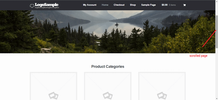
Note that as the page scrolls down, the header stays on top. We have achieved the basic sticky header layout that is not intrusive to the content. It is concise and doesn’t get in the way of the rest of the page.

If you are happy with this, it’s okay to stop here. If you want to take it up to another level, a very common variation of the sticky header is the shrinking header. The shrinking header allows a default full header view when you are at the top of the page. When you start scrolling, the header automatically resizes itself to get out of the way. If you want more coding challenge, read on.

The Shrinking Header

First is to create a js file in your theme’s /assets/js/ folder.

Copy and paste the code below and save it as “stickyheader.js” to the js folder of your theme.

(function($){
	$(document).ready(function () {
		$(window).scroll(function() {
			  if ($(this).scrollTop() > 100){  
				jQuery('#masthead').addClass('sticky');
			  }
			  else{
				jQuery('#masthead').removeClass("sticky");
			  }
        		});
	});	
})(jQuery);

The code basically says it will add the “sticky” class to the header when you’ve scrolled 100px from the top. Else, it will remove it.

Adding the jQuery file to WordPress

Next step is to tell WordPress to include the JS file you just created. Copy and paste the code below to the My Custom Function plugin.

$path = get_stylesheet_directory_uri() .'/assets/js/';
if (!is_admin()) wp_enqueue_script('stickyheader', $path.'stickyheader.js', array('jquery'));

jquery My Customs Function plugin

After this, your JS file will load together with the other js files within your theme. Every time you scroll down, your script will now add the class “sticky” to your header. At this stage, you will not see anything happen yet. This is because we haven’t styled our sticky class yet.

The CSS Code

To style the sticky class, copy this code to your style.css file. Same as before, this is just CSS positioning and resizing. The only difference this time is we attached the “sticky” class on the selectors.

@media screen and (min-width: 768px) {
  	/*resizing the logo image */
	#masthead.sticky .custom-logo-link img {
		width: auto;
		height: 40px;
	}
  
	/*positioning the main-navigation */
	#masthead.sticky .main-navigation {
		text-align: right;
		position: fixed;
		top: 0;
		right: 300px;
		padding: 0;
		width: auto;
	}
  	
	
	/*positioning the logo*/
	#masthead.sticky .custom-logo-link {
		position: fixed;
		top: 0;
		margin: 0;
		padding: 0;
	}
    /*adjusting default margins and paddings*/
    #masthead.sticky .site-header-cart .cart-contents{
        padding:1em 0;
    }
    #masthead.sticky .main-navigation ul.menu>li>a, .main-navigation ul.nav-menu>li>a {
        padding: 1em 1em;
    }
    #masthead.sticky .site-branding{
        margin-bottom: 1em;
    }
	
	/*positioning the cart-menu */
	#masthead.sticky .site-header-cart {
		width: 14% !important;
		position: fixed !important;
		top: 0;
		right: 12%;
		padding: 0;
	}
	
	/*applying the position fixed on the masterhead */
	#masthead.sticky{
		position: fixed;
		top: 0;
		width: 100%;
	}
    /*removing the site search*/
    #masthead.sticky .site-search{
        display:none;
    }
	
} 

The jQuery script above inserts the sticky class to the master head. We just need to implement the CSS positioning as we did before using the sticky class selector.

For example, our selectors will now be “#masthead.sticky”. We just insert “.sticky” to our selectors so it will only be implemented when we scroll down.

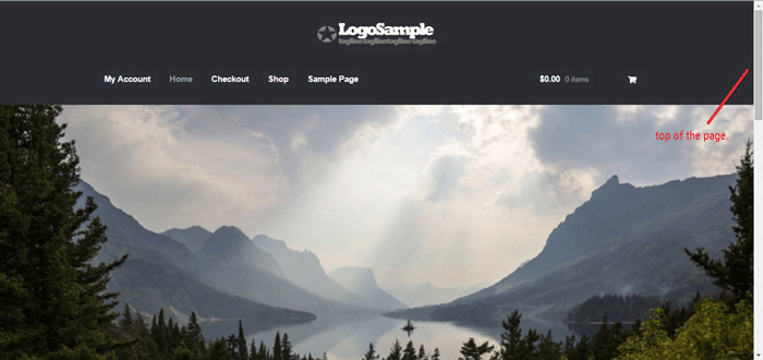
When everything is done, we will be able to see the full header on top of our page.

sticky-header-3

When scrolling down, the compact header replaces the full sticky header.

sticky-header-4

We hope you found this tutorial helpful. If you have any questions or if this didn’t work for you, drop a comment in the comments section and we’ll see what we can do.

Filed Under: Code Snippets, How-To Articles Tagged With: code snippet, design tweaks, navigation, responsive design, Storefront

How to Add a Top Bar in Storefront Theme

July 29, 2016 By John 12 Comments

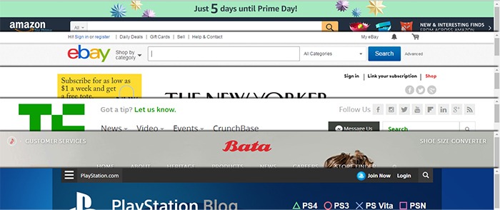
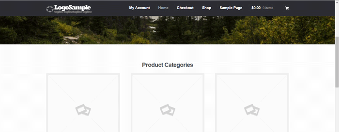
The release of Google’s Material design started the “top bar” trend. It was used mainly on mobile user experience (UX) designs but it found its way into desktop design. In this article, we’ll teach you how to add a top bar to the Storefront theme.

What Elements Can you Add to the Top Bar?

Top-Bar-examples

The top bar has been used in a variety of ways, depending on the UX design or the information you want to highlight. Let’s enumerate common items we see on the top bar.

  • Promotions – This can be anything from a sale to a new product release. The top bar is a good noticeable area that you can use to post your promotions and other offers.
  • User Login/Logout – When users want to log in or out, their eyes will scan the top right corner of the page to look for the link. Because of this, it makes sense to place the link in the top right corner.
  • Social Links – The top bar is a common location for the site’s social media profile links.
  • Mini Cart – The mini cart has a very important role in the UX design of e-commerce stores. It is an important element to have either on the main navigation or the top bar.
  • Search Bar – The search bar is also a crucial piece in the UX design of most websites and it can be positioned in the top bar.
  • Subscription Form/Link – Placing the subscription form on a very prominent location like the top bar draws the attention of your visitors to the form.
  • Quick Links Menu – Quick links can be any important link that you want your visitors to see or something that your visitors will be looking for. Some common quick links are My Account, Shop, Terms and Conditions, Privacy Policy, About, Contact and FAQs.

Depending on your site, you can use the top bar to contain other elements as you see fit.

How to Add a Top Bar to Storefront

To add a top bar to Storefront, you can use the Storefront Top Bar plugin. Our developers at Wooassist developed this plugin specifically for Storefront which adds two widget areas on top of the header.

Getting Started

Storefront-Top-Bar-Getting-Started

Install and activate Storefront Top Bar in your WordPress Dashboard.

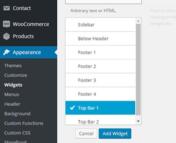
After installation, go to Appearance and click on Widgets. You should find two additional widget areas namely Top Bar 1 and Top Bar 2. These are the left and right widget areas on the top bar. You can add any content here just like in any widget area. Just make sure it looks good within the small space provided.

Adding a Simple Text

Storefront-Top-Bar-Appearance-Widgets

To add text to the top bar, find the text widget and add it to the top bar widget area. After that, you can just add any text in the text widget.

Storefront-Top-Bar-Adding-a-simple-text
Promotion 1 and Promotion 2 are the texts inserted in Top Bar 1 and Top Bar 2, respectively.

Adding a Menu

Storefront-Top-Bar-Adding-a-Menu

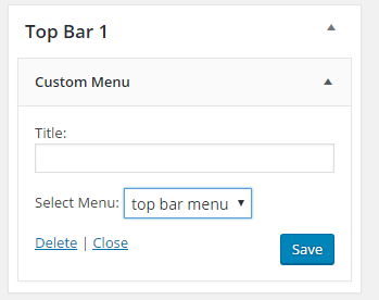
To add a custom menu to the top bar, you should first set up a custom menu in Appearance > Menu. After creating a menu, go back to the widgets area and add ‘custom menu widget’ in the top bar widget area. Select the menu you’ve just created and then click Save. Your custom menu should now appear in the top bar.

Storefront-Top-Bar-1-widget

Adding a Subscription Form Shortcode

You can add shortcodes using the text widget. In this example, we are using Mailchimp for WordPress. The plugin allows for creating a custom form which can be linked to your Mailchimp account. If you want to follow along and are wondering about the HTML markup of the subscription form in this example, you will just need the input type email and the submit button.

<input type="email" name="EMAIL" placeholder="Your email address" required />
<input type="submit" value="Sign up" />

After that, copy the shortcode and paste it in the text widget on the top bar. You can easily tweak the look of your form with CSS. In this case, the CSS we used is below. Feel free to use the code below for your own site. You can make adjustments to fit your needs.

.mc4wp-form input[type=email]{
width: 50%;
}
.mc4wp-form {
margin-bottom: 0;
}

Storefront-Top-Bar-Adding-Subscription-Form-Shortcode

Adding Other Elements to the Top Bar

The top bar works like a regular widget area. You can add shortcodes for other items like social icons, mini-cart, login, etc. You can also insert HTML and scripts in the text widget so the possibilities are endless.

Customizing the Top Bar Widget

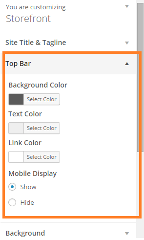
To customize the top bar widget, you can go to Appearance > Customize and click on “Top Bar”. Here you can change the background color, text color and link color. You can also set the top bar to be hidden in mobile view.
Storefront-Top-Bar-Customizing-Widget-Area

You can further tweak the top bar using CSS.

Align Top Bar 2 to the Right

By default, both Top Bar 1 and Top Bar 2 contents are left aligned. To make the content of Top Bar 2 align to the right, just use the CSS below.

.woa-top-bar.col-2 .woa-top-bar-2{
text-align: right;
}

Storefront-Top-Bar-Align-to-the-Right

Thickness/Height

To change the height of the bar, you can specify the height using CSS. Just use the code below and specify the height.

.woa-top-bar-wrap{
height: 35px;
}

Single Centered Top Bar

If you only want one top bar widget with a centered content, do not add any content to the Top Bar 2 widget area and then add the CSS below.

.woa-top-bar-wrap{
text-align: center;
}

Storefront-Top-Bar-Single-Centered

Final Notes

The Top Bar is the first thing that your customers will see on your site. It is one of most prominent areas above the fold. You now have the tools to make use of the top bar. It’s now up to how you will maximize the use of this valuable real estate.

Was this tutorial helpful? Do you have any questions about adding or tweaking the top bar in Storefront? Let us know in the comments.
Filed Under: How-To Articles, Theme and Plugin Reviews Tagged With: code snippet, CSS, design tweaks, how-to, navigation, plugins, Storefront, website development, Wooassist, WordPress

How to Show Only Blog Excerpts in Storefront Theme

November 30, 2016 By John 7 Comments

How to Show Only Blog Excerpts in Storefront

Having a blog has a huge impact on e-commerce sites. A blog helps drive up to 55% more traffic. Blogs are all about providing relevant content to drive visitors to the site. Most blogs in the past prefer the full post display but recently, the snippet view or blog excerpts view has become quite popular. With blog excerpts view, the blog content is more scannable, with posts lined up and a Read More button available after each one. This lets the visitor browse through the posts and just click on the article he/she wants to read more about. In this article, we talk about how to show only blog excerpts in Storefront.

Why Show Only Blog Excerpts?

Increased Visibility

When you have a lot of posts on your blog, displaying only blog excerpts will make more of your content visible. Your latest post may not be the one that the reader is interested in. Having short excerpts of each post will show your visitors that you have a lot of content that they can indulge in.

Ease of Use for Visitors in Choosing Content that Interests Them

With a lot of posts in view, your visitors will be able to easily choose which article to read. This also helps bring more attention to your old posts so keeping those old posts updated with new information will also pay dividends. Readers can scan the blog page easily and may click not just one, but several articles that spark their interest.

Trims Down Lengthy Posts

If you create a lot of long blog posts, then having an excerpts view will make your blog more manageable. A 2000-word blog post is enough to cover a few screens which take attention away from other posts in a full-length view.

Reduced Page Load Times

Since you are only loading post snippets, your blog page will load much faster. Just imagine the number of images on a few of your blog posts and how much longer it would take to load all those.

Increased Page Views and Time on Site

With more content to browse through, showing only blog excerpts will increase your page views. And as visitors read more of your content, you also effectively increase user’s time on your site giving more opportunity for conversion.

Displaying Blog Excerpts in Storefront Theme Using a Plugin

You can switch to a blog excerpts display by editing the WordPress template files. However, you have to be familiar with the WordPress loop and edit the normal content with the excerpts function. An easier method is to use a plugin.

storefront-blog-excerpts-plugin

The Storefront Blog Excerpts plugin is made to work with Storefront theme by WooThemes. This also adds a section in the WordPress Customizer for you to modify how to display your blog content in excerpts view.

How to Use Storefront Blog Excerpts

  • In the plugins page, click “Add New”. Search for “Storefront Blog Excerpts” in the WordPress repository. Click on “Install” then activate the plugin.
  • After activation, the blog archive will be automatically replaced by the excerpts display.
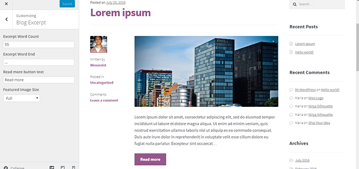
  • You can further customize how your blog archive is displayed. Go to the Appearance > Customizer and find the Blog Excerpts section.
  • You can modify the following properties in this section.
    • Excerpt word count – The default value is 55. The average word count of an academic paragraph is around 100 – 200. 55 is around half of it. Based on this, adjust how many words you want to display in each excerpt.
    • Excerpt word end – The default value is “…”. You can customize on the symbols that you can use to indicate a continuation. Other not so common symbols are “>”and “->”
    • Read more button text – The default value is “Read more”. This is the basic call-to-action. You can be more descriptive on the text and try “Go to Full Article”.
    • Featured image size – The default value is “Full”. Here, you can choose different sizes of feature images.

How to Show Only Blog Excerpts in Storefront

Have you tried displaying only blog excerpts on your WooCommerce store’s blog? If you haven’t, you should consider doing it as it might just get you more page views and increased time on site. If you have tried the plugin above, let us know your experience about it and your ideas on how it can be improved.

Filed Under: How-To Articles, Theme and Plugin Reviews Tagged With: best practices, how-to, navigation, plugins, Storefront, Wooassist

The Wooassist Blueprint: What Goes on in the Wooassist Backend

July 22, 2016 By John Leave a Comment

We’ve created our fair share of WordPress sites and provided support for other WooCommerce store owners since 2014. At the same time, we maintain and improve Wooassist.com. But what goes on in the Wooassist backend? Here we’ll provide a sneak peek of what goes on behind the scenes.

Publishing Platform

wordpress-logo

WordPress is one of the best Content Management System (CMS) with over 60 million websites powered, Woasssist included. It is free and open-source, with thousands of available plugins and themes to change and extend the look and functionality of your site.

Hosting Provider

WPEngine-logo-white

WPEngine provides one of the best WordPress hosting services on the web. Our hosting plan with WPEngine comes with caching, backup features and Content Delivery Network (CDN) provided by their partner MaxCDN. They use Ever Cache for speed and massive scalability. They also have one of the best support compared to other hosting providers.

WordPress Themes

Genesis Framework

logo-Genesis-Framework

Genesis Framework is a powerful foundation for building websites in WordPress. It is compatible with WooCommerce and anything can be customized around its core code using child themes. It is also SEO optimized.

 Parallax Pro

logo-Parallax-Pro-white

We use Parallax Pro theme on top of the Genesis framework. Notice how the Wooassist homepage content has a vertical design for easy visual eye movement and flow. As you scroll down the page, you will see that the content is divided into sections. The theme is also mobile responsive.

Installed Plugins

It is best practice to deactivate and delete any unused plugins on your site to minimize site bloat. Just stick to what features you need and the plugin that offers just that.

WooCommerce

WooCommerce

Since Wooassist provides WooCommerce support, it makes sense that we use WooCommerce.

Built with developers in mind, WooCommerce is extendable, adaptable and open source. It works with the core features of WordPress and is one of the most widely used ecommerce plugins. It’s free and allows for maximum flexibility and customization. You can even expand its features with a growing collection of more than 300 extensions.

WooCommerce Customizer

WooCommerce-Customizer

WooCommerce Customizer is a free plugin that adds an extra settings page for WooCommerce. This helps you make quick changes which otherwise would require writing some custom PHP functions. Basically, you can optimize the look of your WooCommerce store for optimum conversion, without writing any code.

Genesis Connect for WooCommerce

Genesis-Connect-for-WooCommerce

When WooCommerce is installed on a site using the Genesis platform, you may find some product pages do not display properly. Genesis Connect for WooCommerce fixes this by replacing WooCommerce’s built-in shop templates with its own Genesis-ready versions. These templates are single-product.php, archive-product.php and taxonomy.php.

WooCommerce Google Analytics Integration

WooCommerce-Google-Analytics-Integration

WooThemes created WooCommerce Google Analytics Integration plugin and is a must to integrate analytics in WooCommerce versions 2.1 and up. This plugin inserts tracking codes into your store pages.

WP-Optimize

WP-Optimize

We use WP-Optimize to clean and keep our database down to a reasonable size. The plugin helps clean up your WordPress database by removing old revisions of posts and stale/trashed comments. It also allows for optimization of your WordPress core tables.

WordPress Related Posts

WordPress-Related-Posts

WordPress Related Posts automatically adds thumbnails at the footer of your content. This helps readers find other relevant posts in our blog for further reading.

WooCommerce Paypal Pro

WooCommerce-PayPal-Pro

We use WooCommerce Paypal Pro as our payment gateway. Our clients can pay with their credits cards. A Paypal account is not necessary.

WooCommerce Checkout Manager

WooCommerce-Checkout-Manager

We use WooCommerce Checkout Manager to customize the fields on our checkout page. This allows for faster and easier checkout.

Akismet

Akismet

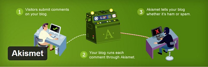
We trust Akismet to safeguard our site against spam comments. This product by Automattic comes bundled with WordPress installations. You just need to sign up at their website and get your API key to activate it. Akismet automatically checks incoming comments and moves ‘spam-like’ comments to the Spam folder.
PopupAlly

PopupAlly

We use PopupAlly to show time-delayed and exit intent popups for our free e-book offer and newsletter subscription, respectively. The plugin makes it easy to customize popup forms even for novice users.

Yoast SEO

Yoast-SEO

We use Yoast SEO to optimize our blog post and pages for SEO. It is a powerful plugin that helps to give any site an SEO boost. This plugin can also help optimize product pages and product categories in WooCommerce.

Visual Form Builder

Visual-Form-Builder

We use Visual Form Builder to create forms such as our contact form and custom package form. Visual Form Builder is easy to set up and use even for novice users.

Responsive Pricing Table

Responsive-Pricing-Table

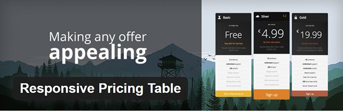
We use Responsive Pricing Table plugin to add a ‘Pricing Tables’ tab in the WordPress admin panel . This allows for creating pricing tables without coding. You can add features of up to 5 plans and display the price table anywhere with a shortcode.

Redirection

Redirection

Redirection is a free plugin that makes managing our 301 redirects easier. It also helps us keep tabs on any 404 errors. We use this mainly when changing slugs of blogs post when optimizing for SEO.

Filed Under: Theme and Plugin Reviews, Wooassist News Tagged With: Genesis, navigation, optimizations, plugins, PopupAlly, redirection, website development, Wooassist, WooCommerce, WooCommerce products, woothemes, WordPress, WPengine, Yoast

  • « Previous Page
  • 1
  • 2
  • 3
  • Next Page »
Let us support your online store so you can manage your business

Get started today

Get 2 Hours of FREE SUPPORT

We are so confident that you will love our services that we will give you your first 4 hours at a 50% discount

That’s 4 hours for only $75

BUY NOW

Free eBook

5 Things Every Online Store Can Fix On Their Website In The Next Week To Increase Sales

Quick Links

  • How it Works
  • Pricing
  • Blog
  • Contact
  • About Wooassist
  • My Account
  • Checkout
  • Privacy Policy
  • Cookie Policy
  • Terms and Conditions

Wooassist

Australia:
59 Luke St.
Hemmant QLD 4174

Philippines:
San Miguel St.
Poblacion, Iligan City 9200

Connect


Copyright © 2026 · Wooassist

Yours FREE!

5 Things Every Online Store Can Fix On Their Website In The Next Week To Increase Sales